Comment
<Click on chart for larger image>
We also tried to explain the payroll measurement problems explained below. We believe this is another factor in explaining the poor productivity data.
- Real-Time Economics (WSJ Blog) – (May 25, 2015) Jon Hilsenrath: Fed Confronts an Economy Plagued by Mismeasurement
A note from Goldman Sachs economist Jan Hatzius this weekend touches on a theme that seems to be getting a lot of play of late in the world of central banking: Mismeasurement. Do we really know the world economists are trying to describe to us on a daily basis? And if we don’t, are central bankers in any position to feed this world appropriate amounts of money and interest? Goldman’s note raises questions about measurement of productivity, growth and inflation. “Structural changes in the US economy may have resulted in a statistical understatement of real (economic) growth,” Mr. Hatzius argues. The data, he says, might not be picking up changes in the economy resulting from the rapid spread of advanced software and digital content. Inflation statistics, moreover, might not grasp the leaps in quality of, say, the camera on your iPhone. My camera, for instance, can capture my dog catching a ball in slow motion, which is very cool and something I’ve never been able to do before. Mr. Hatzius argues inflation, growth and productivity statistics have been understated because the data don’t pick up the consequences of this technological change.
<Click on chart for larger image>
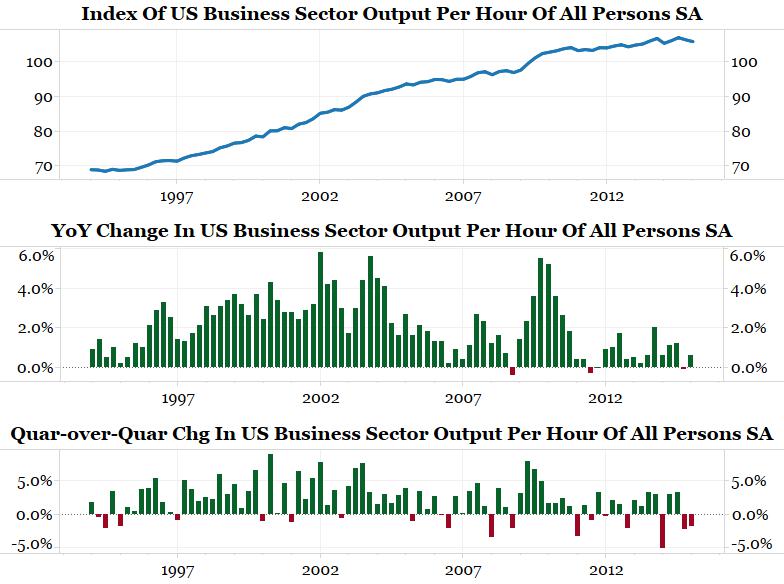
See the bottom panel above. The quarter-over-quarter productivity data just completed two consecutive declines for the first time in over 20 years! Does anyone actually believe in this era of rapid technological advances that the U.S. economy has suddenly become that inefficient? We tackled this question in March:
The payroll numbers are inconsistent with all other economic releases, earnings reports and market reactions (collapsing commodities). The payroll report says the economy is humming along nicely, but nothing else is confirming this.
Productivity, which is simply GDP growth minus aggregate labor output, highlights this deviation nicely. … The chart [above] shows the year-over-year change in productivity. This figure was negative for only the third time in 20 years during Q4 2014 (latest data).
Has the American economic suddenly become inefficient? We doubt it, so maybe some of the data is wrong. Most are inclined to explain away the poor data by pointing to factors such as weather. Maybe the weak data, which constitutes the majority of economic releases, is not wrong though. Perhaps we should be re-examining the one data point that is strong, non-farm payrolls.
We first argued that something might not be right with the payroll report last December. Below is an update.
Measuring Jobs
The BLS was created in 1915 to study jobs in four industries: boots and shoes, cotton goods, cotton finishing, and hosiery and underwear. Then, according to the BLS handbook:
During the Great Depression, there was controversy concerning the actual number of unemployed people; no reliable measures of employment or unemployment existed. This confusion stimulated efforts to develop comprehensive estimates of total wage and salary employment in nonfarm industries, and BLS survey data produced such a figure for the first time in 1936.
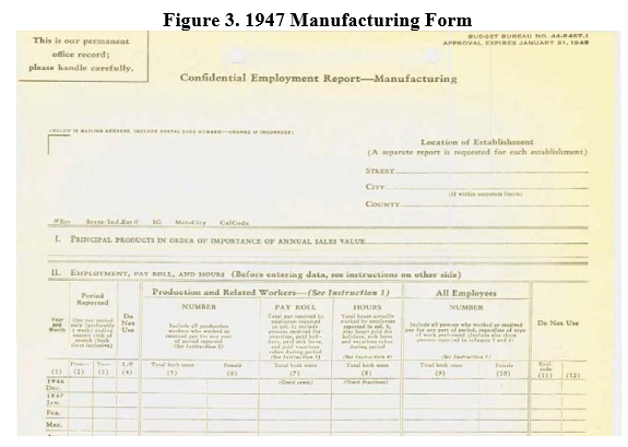
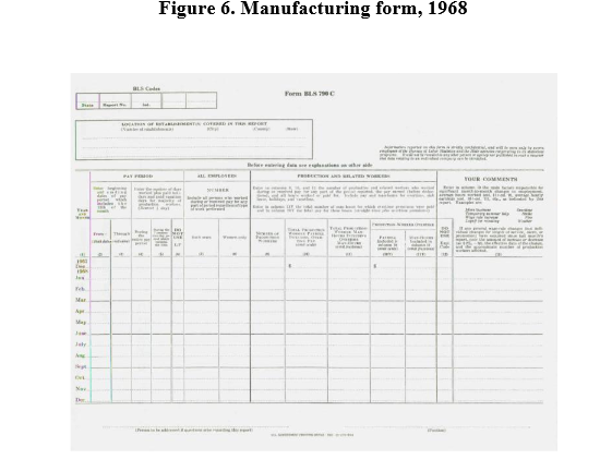
From 1915 to the early 1980s the BLS mailed a one-page form to roughly 60,000 establishments asking them for employment information. This data was compiled into the non-farm payroll report.
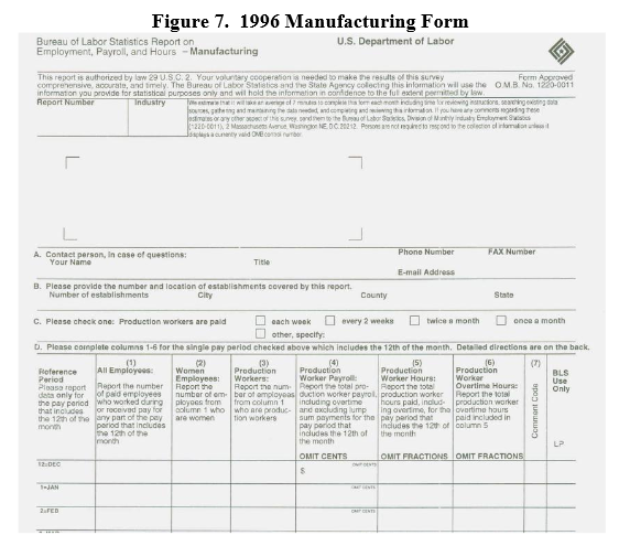
The one-page form used by the BLS was essentially unchanged from 1915 until it was revised in 2012 (no typo!). Below is how the form for manufacturing firms looked in 1947, 1968 and 1996. It is virtually the same form.
<Click on graphic for larger image>
<Click on graphic for larger image>
 <Click on graphic for larger image>
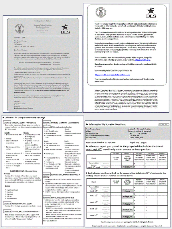
Starting in 2012 the form was changed to four pages:
<Click on graphic for larger image>
Why was the form changed? As the BLS explained:
In 2008, the BLS started a research program to address problems with the design of the current form and produce a redesigned enrollment package. Objectives of the research were to improve efficiency of the interviewers through improved ability to explain the reporting task, to improve the respondent ’s comprehension of the task, and to decrease respondent burden.
Four goals for the redesigned package were identified. Two of the goals, items 3 and 4, were seen as significant for the project:
- Convince the recipient to open the package.
- Convince the recipient to read and attempt to understand the contents of the mail- out package.
- Provide a reasonably clear explanation of what the recipient is being asked to do.
- Persuade the recipient to comply with the request.
Research found five problems that affected the form’s ability to provide a reasonably clear explanation of the survey task:
- The cover letter is not well connected to the form.
- The reference period is not understood.
- Respondents do not understand that they will be called each month.
- Some respondents complete all months of reporting at once.
- The complexity of instructions for reporting multiple payrolls caused non- response.
Nowhere did they address the issue of results being skewed toward a positive response bias because of the new questions. In fact, here is what the BLS concluded about the new form:
We believe that the new form offers improvements in interviewer efficiency and data quality. These benefits include:
- Converting to a four page design eliminated a source of mismatched letters and forms.
- Improvements in Item Non-response were observed.
- Interviewers reported that it was easier to enroll firms with the new form.
- Kansas City and Niceville enrollment time results confirmed this observation. Collection times were also faster in Kansas City and Niceville.
- Response and Collection rates were similar between test and control samples.
- In other words, the BLS was looking to “push down” the burden of responding to the respondent in order to reduce the cost of collecting the payroll report. While this is a worthy goal, our inquiries to the designer of the new form and the BLS reveal that no one tested to see if this change would result in a response bias. We fear that it might have. Who takes the time to read the four page report and respond (as opposed to the more expensive process of a surveyor leading you through the process?). We believe the answer is someone that has good news (i.e., hiring employees) and wants to say it.
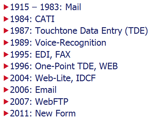
The Internet Changes Things
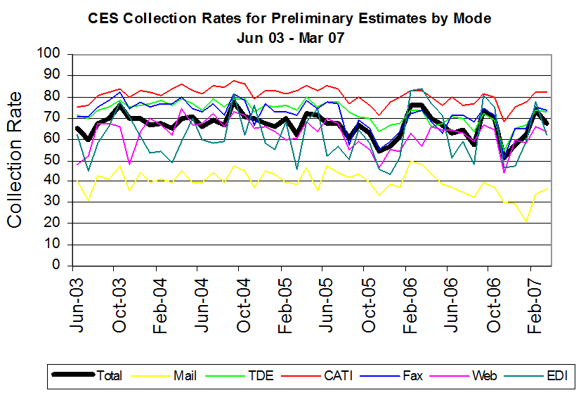
<Click on graphic for larger image>
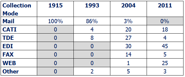
EDI = Direct Electronic File Transmission
Web = via the internet
TDE = Touch-tone data entry
Mail = Traditional Mailing of Forms
Fax = Faxed responses
<Click on graphic for larger image>
<Click on graphic for larger image>
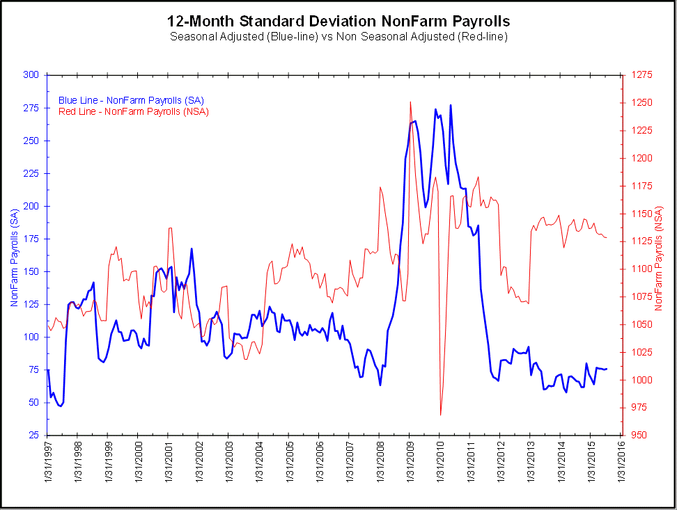
<Click on chart for larger image>
..and reduced the revision volatility of the report.
<Click on chart for larger image>
Does this represent a stabilization in the labor force? Or, has the new multi-mode collection and new form led to higher positive response rates, better measurements and the appearance of greater stabilization in the payroll report? While more accurate readings would definitely be a plus, are economists misreading this stability as a positive sign for the economy?
The problem is we do not have enough data to test this hypothesis. That said, we suspect a measurement issue is causing this apparent stability and not a change in the workforce.