Summary
Comment
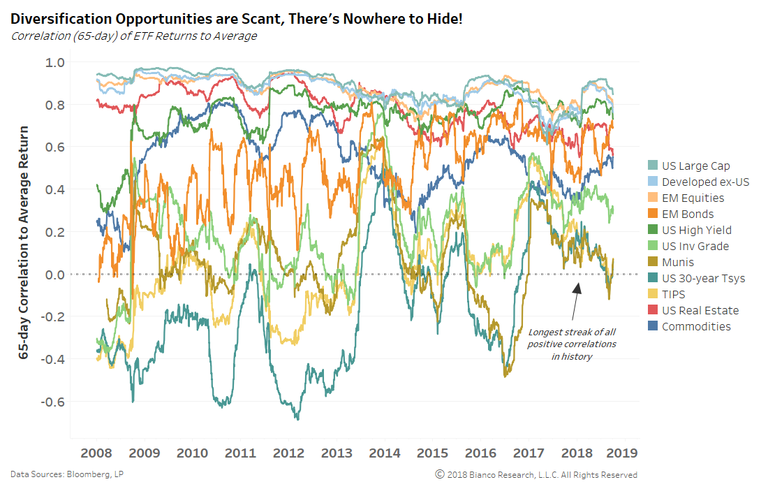
Earler we noted that constructing a diversified portfolio is hard than ever as the chart below shows the rolling three-month correlation of major ETF returns to a portfolio average. Not a single asset class offered a negative correlation throughout 2017 into August 2018.
A brief period of negative correlation to the portfolio average by U.S. Treasuries, inflation protection (TIPS), and municipal bonds in August and September 2018 has ended.
The Stock Bond Relationship
Markets are not stationary. Relationships change. It is critical for any investor to be able to recognize the longer-term regime shifts as they occur.
Should a regime shift occur without one adjusting to the new reality, a portfolio will suffer. Conversely, if an investor changes in anticipation of a regime change without one actually occurring, it can be equally as painful.
For the first time since the late 1990s, we believe a regime shift could be underway in the relationship between stocks and bonds. Markets are transitioning from a deflation mindset to an inflation mindset. Because the relationship between stocks and bonds is critical to popular investing strategies of the last two decades such as risk-on/off, the 60/40 portfolio and risk-parity, such a shift would have major implications.
Mindsets
The top panel of the chart below shows the S&P 500 (blue) and 10-year yields (red) since 1947. The bottom panel (green) shows a rolling 5-year correlation of the weekly change in stock and bond prices. Its intention is to show the changing secular relationship between stock and bond prices.
The shaded area highlights the period from 1966 to late 2001 when stock and bond prices were positively correlated. During this time, inflation concerns were a driver of prices. When stock prices went up, bond prices also went up. Or, when stock prices went up, bond yields went down. When the markets were relieved there was no inflation, bond yields went down and stock prices went up. When the markets worried inflation was heating up, bond yields went up and stock prices went down.
From 1954 to 1966 and since 2001, this rolling five-year correlation has been negative. During this period, the main concern has been a deflationary mindset. Stock and bond prices move in opposite directions. Or, when stock prices go up, bond yields go up. Why? When the market worries about deflation taking hold, yields fall alongside stock prices. When the market is relieved that there is no deflation, yields rise along with stock prices.
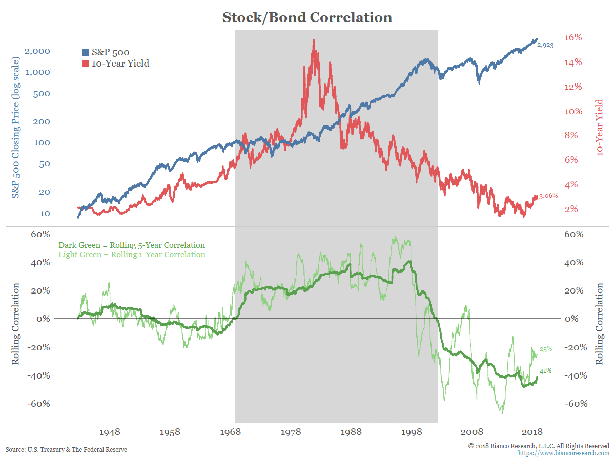
The chart above shows a long-term look at the stock-to-bond relationship. With a rolling 5-year correlation of -40%, it suggests the deflation mindset, or the negative correlation, is years from turning. But there are shorter-term measures that suggest this change is already underway.
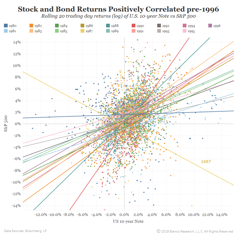
1980 to 1996 Relationship
The scattergraph below shows the period 1980 to 1996, the shaded area above. It shows a rolling 20-day change in the S&P 500 (y-axis) and the price of the 10-year note (x-axis). Each year denotes a different color and each year’s trend line is also shown.
Note that the relationship between these two assets’ prices was positive most of these years, when stocks rallied, bond rallied (upper right quadrant). conversely, when stocks declined, bonds declined (lower left quadrant). This is the inflation mindset described above.
The exception was 1987 as the stock market crash in October of that year distorted everything,
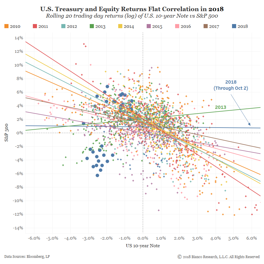
The next chart starts in 2010 (post-crisis) and has the same format as the chart above. The relationship showed actually started in 2003 (we started in 2010 for readability purposes).
Note the relationship between stocks and bonds is the inverse from above. While the period shown in the chart above was a positive slope, since 2010, this has largely been a negative slope. When stocks gained, bonds suffered (upper left quadrant). When bonds gained, stocks suffered (lower right quadrant). This is the deflation mindset described above.
The two exceptions were in 2013, which only had a slight upward slope, and in 2018, which has a flat correlation.
2013 and 2018 have common themes that make this relationship different than other post-crisis years. The defining characteristic of 2013 was the taper tantrum, when the market feared the end of Fed/central bank stimulus. Bonds and stock fell together in 2013, although the relationship was not terribly strong. So far the defining characteristic in 2018 is the return of inflation and the market’s fear that Fed/central banks are going to have to remove the stimulus faster than anticipated.
How Things Change
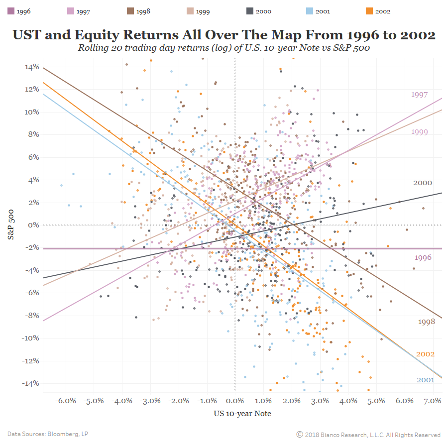
The final scattergraph in this series shows the period from 1996 to 2002. This is when the relationship transitioned from the inflation mindset (shaded area in the long-term correlation chart above) to the deflation mindset. Note this period was not stable.
- 1997 saw a strong positive slope
- 1998 saw a strong negative slope
- 1999 saw a strong positive slope again
- 2000, 2001 to 2002 saw the slope fall each year, and then stay negative through today.
We would argue that the main driver of the stock/bond relationship is the perception of inflation, or mindset as we term it.
- When the markets fear inflation, the relationship is positive.
- When the markets fear deflation, the relationship is negative.
The transition between these two mindsets is long and messy.
Currently, the market is transitioning to an inflation mindset, as shown below. The relationship between Fed hikes (y-axis) and inflation expectations (x-axis) is nearly a positively sloped 45-degree angle. This means a one-for-one relationship between inflation and Fed policy. We detailed this last month in Inflation Expectations, the De Facto Fed Chairman.
Conclusion