Summary
Comment
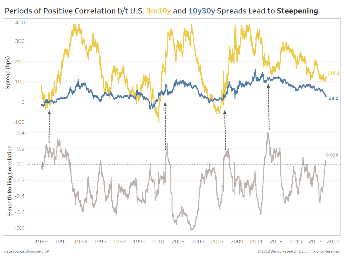
The chart below shows the U.S. 3m10y (yellow) and 10y30y (blue) spreads in the top panel along with their rolling three-month correlation in the bottom panel.
These opposite ends of the yield curve have shed their typical negative correlation. Arrows in the chart below mark protracted periods of modestly positive correlation, which occur near the beginning of steepening cycles since 1990.
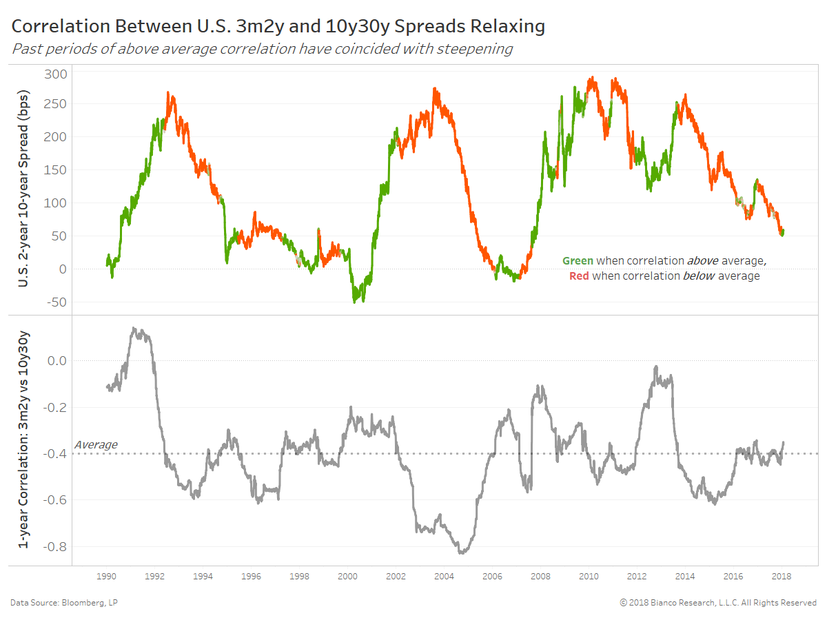
The next chart analyzes even more distant spreads along the curve between the U.S. 3m2y and 10y30y. We have lengthened the correlation window to one year, which is shown in the bottom panel.
The U.S. 2y10y spread in the top panel is green when the correlation is above the long-term average and red when the correlation is below the long-term average. Steepening predominately occurs when the correlation between very short-end (3m2y) and very long-end (10y30y) spreads are running above average. Will this correlation (-0.35) continue to rise in 2018 to well-above average?
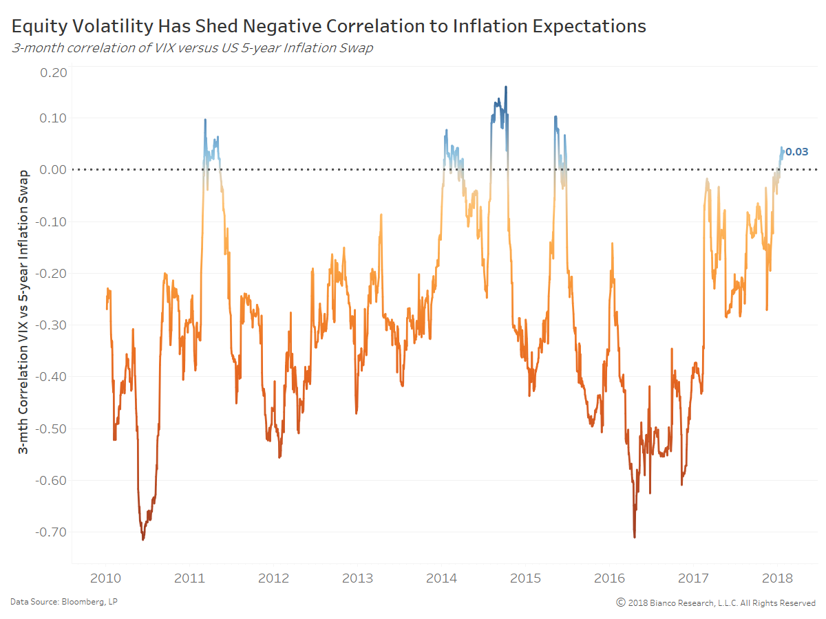
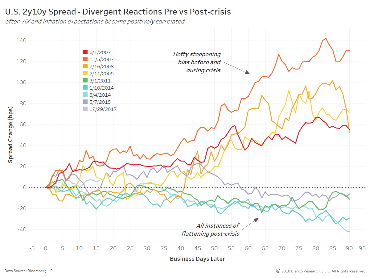
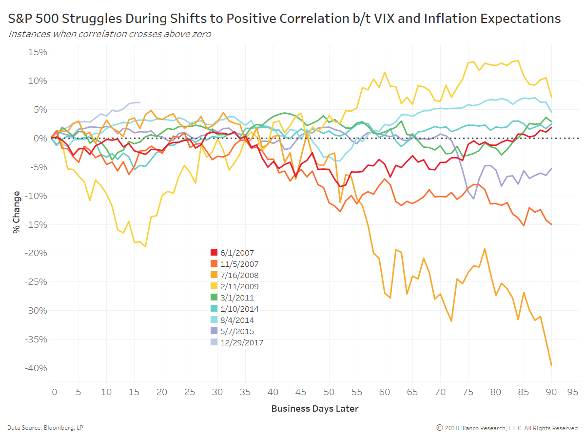
The U.S. 2y10y spread reacted to positive correlations between the VIX and inflation expectations with swift steepening prior to and during the financial crisis. However, the spread has seen modest flattening post-crisis with investors remaining skeptical over supposed impending inflation.
We have noted options on inflation, which are some of the purest measures of inflation expectations, are showing rapidly rising odds headline inflation will exceed 2.5%. These odds must break above early 2017 highs to generate a stamp of approval.