Inflation Watch – A Light at the End of the Tunnel


Summary

CPI came in well below expectations again in November. Projecting where inflation will be in several months is an impossible task, but running through several scenarios offers some perspective.

Comment

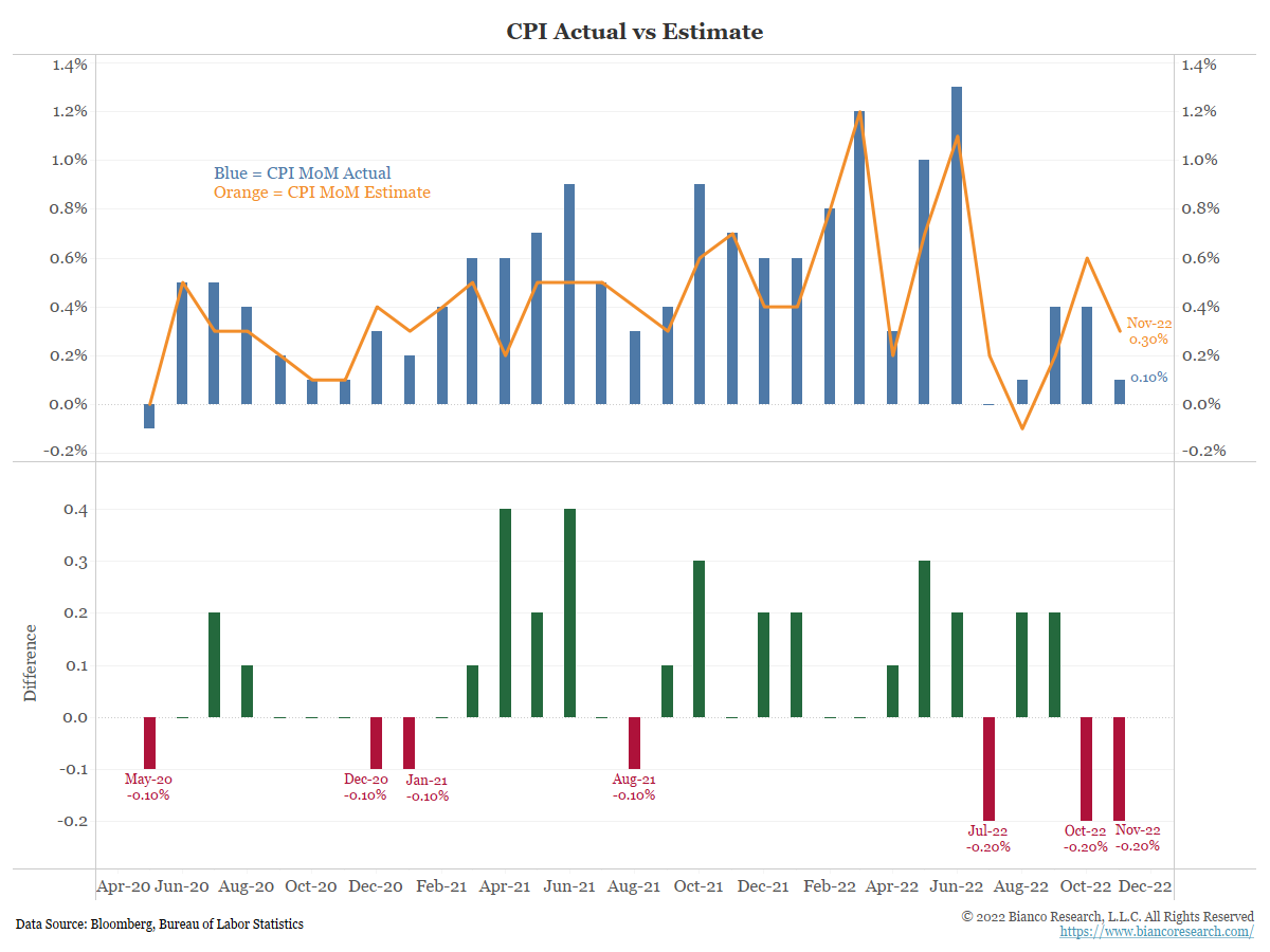
As the chart below shows, month-over-month headline CPI (blue bars) came in below the median Wall Street forecast (orange line) again in November. This now marks the third time in the past five months that Wall Street proved too high, breaking a trend of projections that were consistently too low over the past couple of years.


Between December 2021 and June 2022 (red), the month-over-month change in CPI was much higher than in the 2020 period. This means the current monthly numbers will have a much higher bar to surpass if inflation is going to remain elevated. This month’s 0.1% MoM change replaced a 0.7% month-over-month change from November 2021, which helps explain the continued drop in headline inflation.
In fact, CPI would have to average 0.83% over the next seven months just to keep pace with the current inflation rate. For reference, the pre-pandemic QE era average for MoM inflation was just under 0.15%. The covid-era (March 2020-current) MoM average has been 0.43%.


So how does today’s lower-than-expected CPI release change the year-end scenario analysis we originally offered in July?

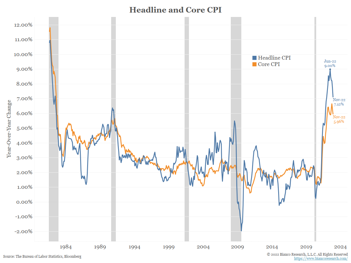
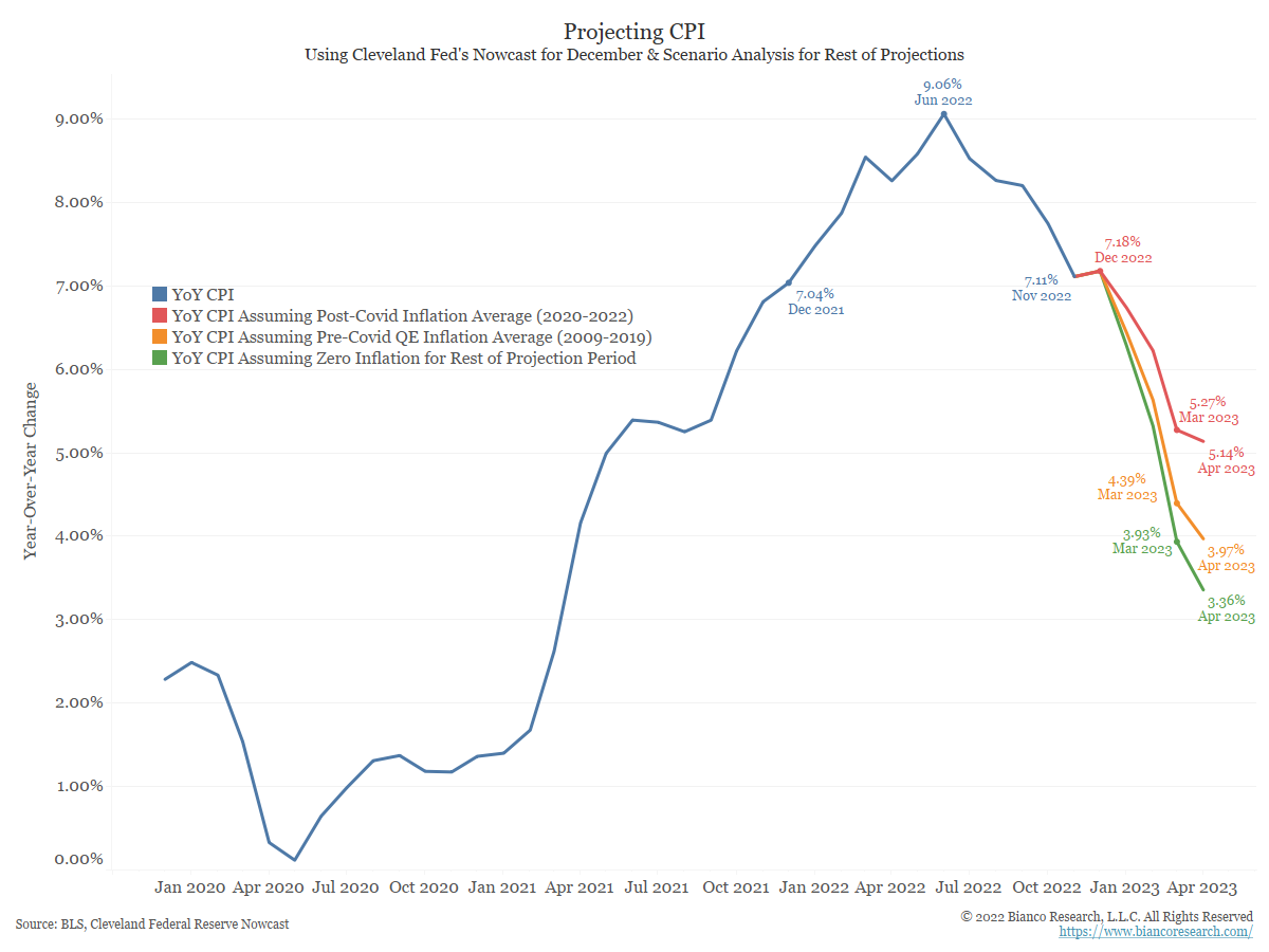
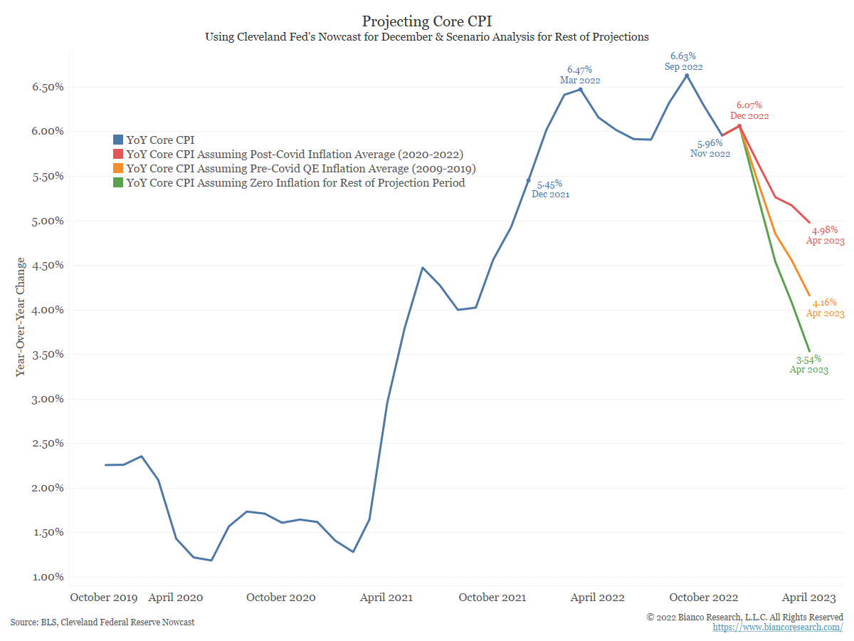
The blue line in the chart below shows year-over-year CPI, which rose by 7.11% in the twelve months through November 2022. For the scenarios below, we assume the Cleveland Fed’s CPI Nowcast of 0.37% month-over-month inflation for December will be correct.

The red line shows CPI would be 5.27% by the end of Q1 2023 if the month-over-month releases equal the average seen since the pandemic began in 2020. The orange line shows CPI would be 4.39% at the end of Q1 if the month-over-month releases equal pre-pandemic QE-era inflation. Finally, the green line shows CPI would 3.93% by March 2023 if the month-over-month releases show 0% inflation between now and then.

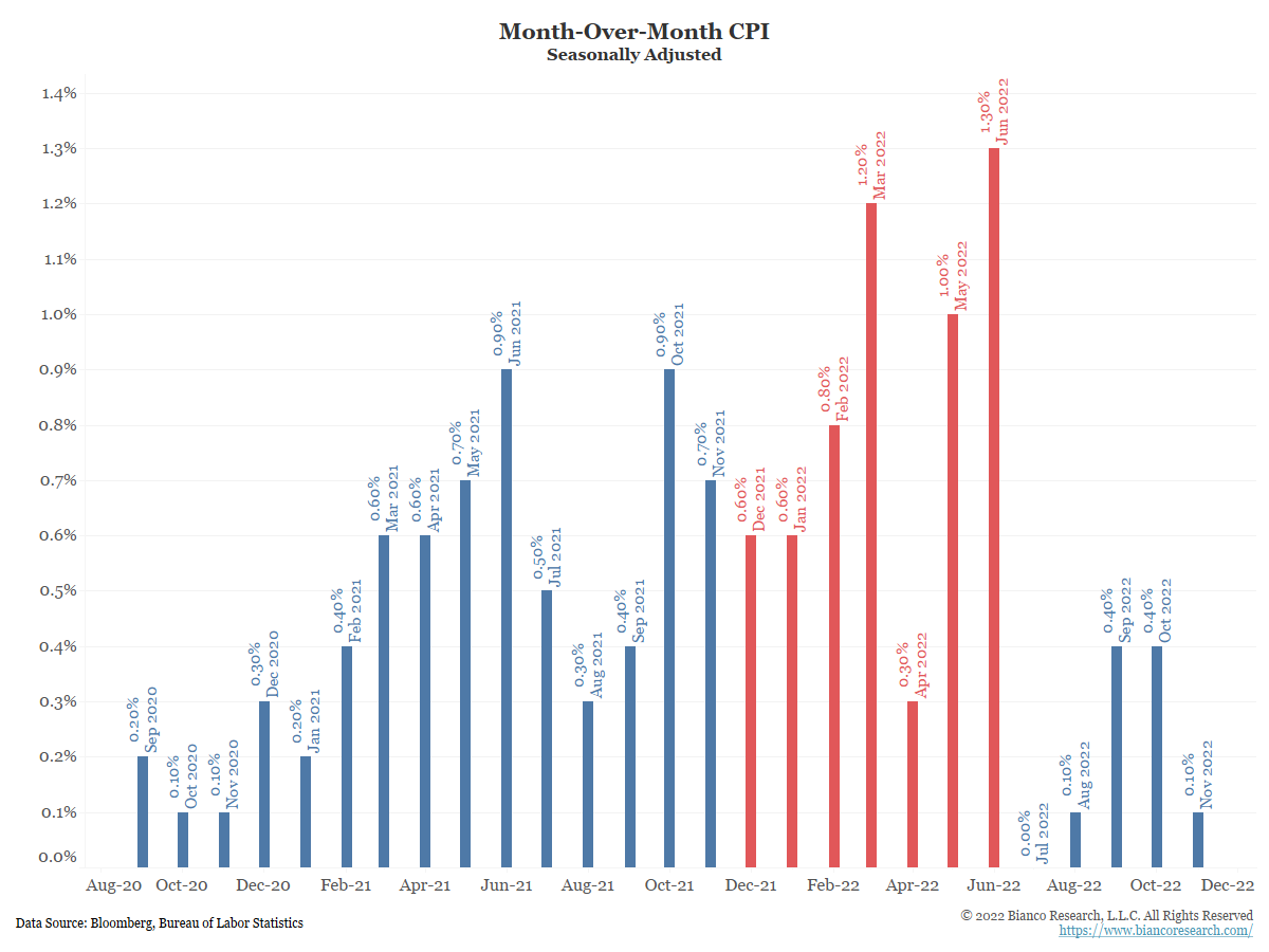
As we wrote last month, this is the period where the rubber meets the road on inflation. Based on the month-over-month numbers being so high a year ago, any shortfall on the inflation front will lead to a quick decline in the year-over-year numbers. That is precisely why risk markets took off this morning on the low inflation print.


For comparison, the chart below shows the same scenarios for Core CPI. It is a bit more difficult to say this series has definitely peaked, but the scenarios show potential for further declines.


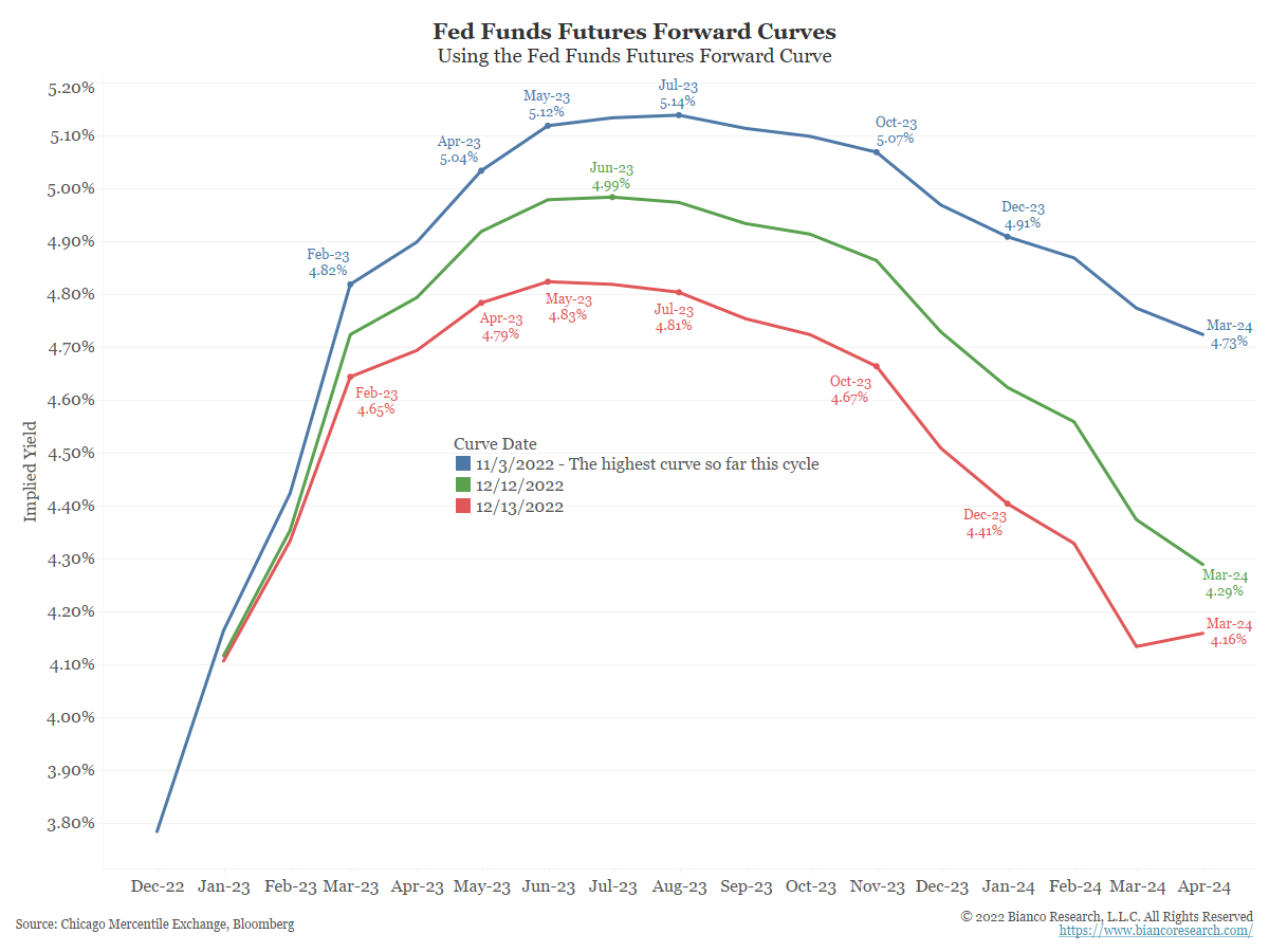
So how has the market’s opinion on the Fed’s likely course changed in the wake of today’s positive inflation news? The chart below shows the fed funds forward curve as of three dates. The blue line shows the highest point the curve reached in this cycle (November 3), with the terminal rate projected to be as high as 5.14%.

The green line shows the curve as of yesterday’s close, with a terminal rate of 4.99%. After this morning’s CPI release, the red line shows traders are now projecting the terminal rate to ‘only’ reach 4.83%.


Today’s data does not change expectations for tomorrow’s FOMC meeting in any meaningful way. As the chart below shows, anything other than a 50 basis point hike would be a big surprise.
 
 
The market’s thoughts on the February meeting are a bit more interesting. As of yesterday’s close, the market was pricing in a 65% chance of another 50 basis point hike on February 1. In the wake of CPI, those odds are now just 38%. In other words, the market is starting to price in another step down to a 25 basis point hike. Nick Timiraos has yet to weigh in as of this writing, so these odds could quickly change.


We continue to circle the next several months as a period in which headline inflation numbers could provide some relief for Fed officials. Traders are aware of this and will be watching how fast the year-over-year number begins to fall.
If inflation follows the red lines in the projection charts above, we could still be staring at 5+% CPI around March/April. If energy and housing prices ease, the orange lines in the projections above might prove more accurate. In that case, CPI would be closer to 4% come April.
The Fed is trying to be nuanced in stating rate hikes could slow while the terminal rate might be higher than expected. How high that terminal rate goes will be entirely dependent on how fast inflation comes down during the period we are highlighting. Based on the market’s reaction this morning, traders are optimistic that there may be light at the end of the tunnel. Stay tuned.
 

Interactive Visual

For those who wish to dig deeper into this month’s inflation releases, the interactive visualization below offers charts on CPI, PPI, PCE, global inflation, and inflation expectations. The time frames, subindices and annualization periods can all be changed for a customized view. This month we default the view to various measures of inflation expectations.


REQUEST A FREE TRIAL