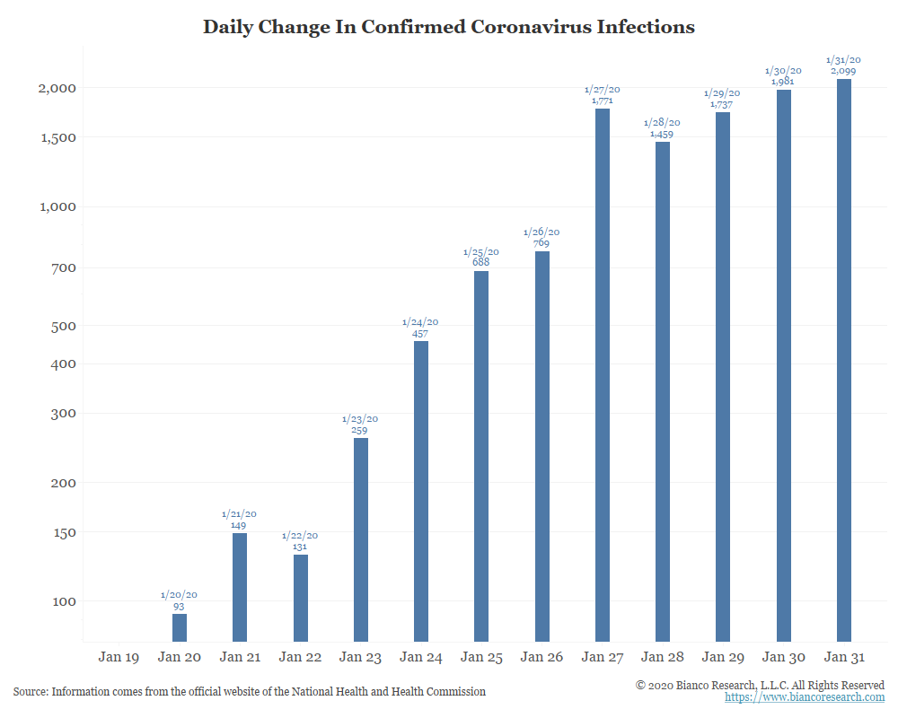
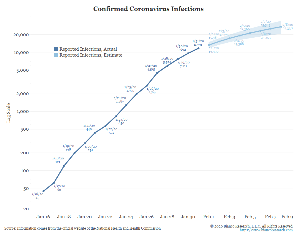
Note that the chart above is on a log scale. This is how virus growth. Based on my understanding virus growth rate is not supposed to exhibit a hard arithmetic limit in its increase.
This seems to be the case. As confirmed infections seem to have hit a limit of increases at 2,000 per/day over the last five days.
Interestingly, several media reports have mentioned in passing that the production of testing kits has been limited to about 2,000 a day.
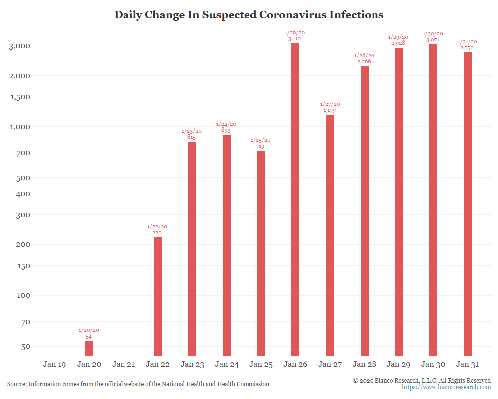
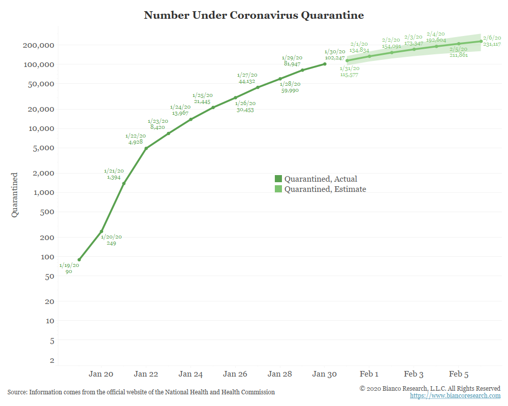
The number of suspected cases also seems to have hit an arithmetic limit of 3,000 a day over the last five days.
Again, virus growth is not supposed to work this way.
Does this suggest a physical limit for the Chinese? Or, are they just making it up?
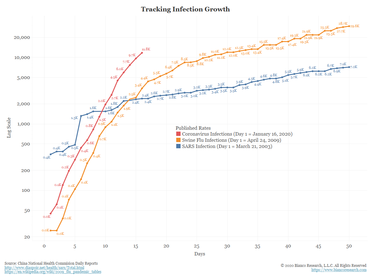
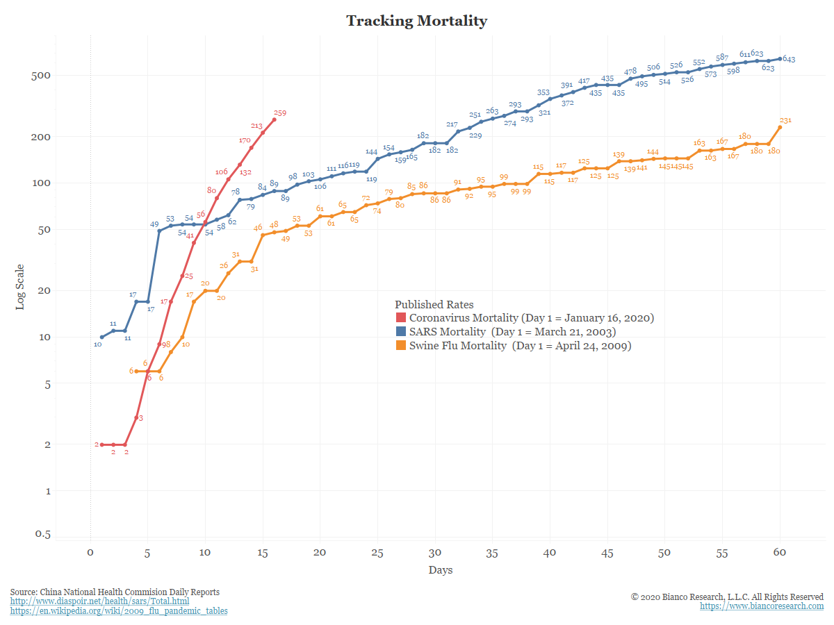
The chart below plots the progression of this virus to SARS in 2003 and the swine flu in 2009.
Note that day 1 in the chart below begins when published data starts reporting. This is why the charts do not start at zero or one (they pick up those early cases on day 1 of reporting). So it compares day 15 of reporting, not day 15 after the first known case.
The published data shows that coronavirus infections (red) have already surpassed the 60-day reporting total for SARS in 2003 (blue) and has grown at a faster rate than the 2009 swine flu (orange).
So based on available data, this is the fastest growth of the three.
Finally, some other charts detailing the published data.
![]()
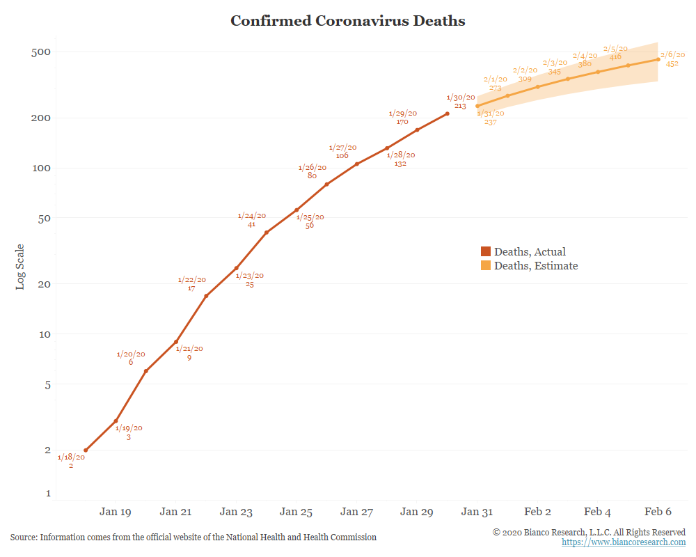
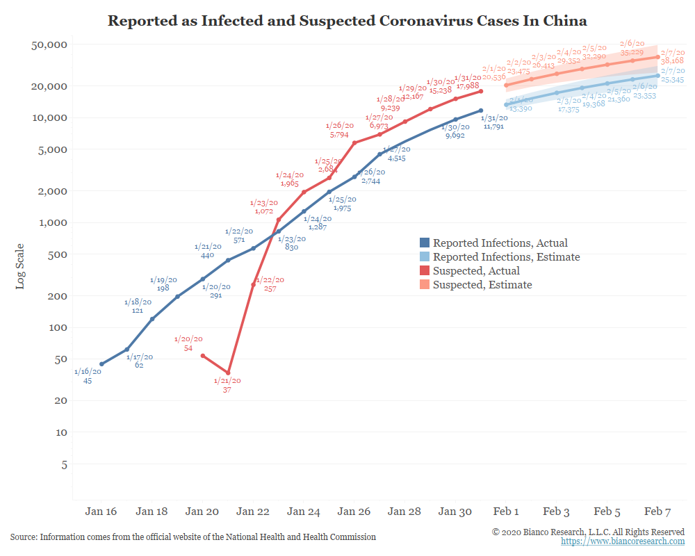
Below is our collection of coronavirus charts updated through Day 16 of reporting, January 31, 2020.
First An Observation – A Hard Arithmetic Limit In Virus Growth?
Many news reports suggest that the Chinese are limited in their health facilities and/or production of testing kits to confirm infections.
The next chart shows the latest number of confirmed infections and suspected infections. Also shown is a simple polynomial regression used to forecasts the next 7 days, with a 95% confidence interval.