- Bloomberg – Dan Loeb Tells Investors to Keep Eye on ‘Rosy’ Growth Outlooks
Dan Loeb said while he’s watching inflation and interest rates, the bigger concern is if investors are overly optimistic about earnings and economic growth. “The more pressing issue is whether the rosy assumptions that everybody has about earnings growth this year and next year will be met,” Loeb said Thursday on a conference call discussing results for Third Point Reinsurance Ltd., where he oversees investments. “I’m not saying they won’t be met, but it’s definitely something, given some of the recent economic data which tends to be noisy, we need to keep an eye on.”
Summary
Comment
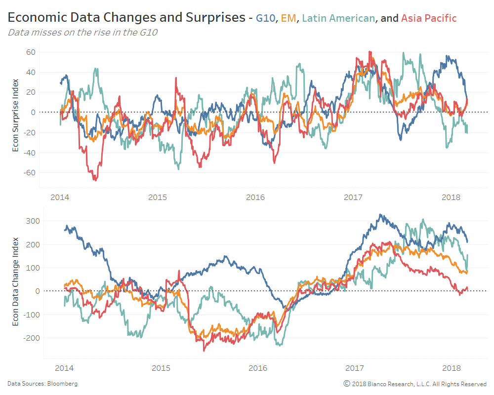
The chart below shows Citigroup Economic Surprise (top panel) and Data Change (bottom panel) indices for the G10, emerging markets, Latin America, and Asia Pacific. Data change indices measure actual data releases in relation to one-year average growth rates.
Economic data surprises have greatly slowed across the G10 to begin 2018, following the lead of emerging markets. In fact, the more comprehensive global surprise index has fallen below zero, meaning more misses than upside surprises.
The more important data change index for the G10 has yet to signal slowing realized growth rates. But, history suggests such strong growth will not last long in the event of a return to missing expectations.
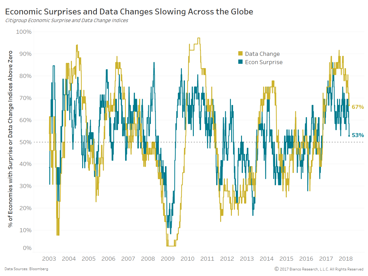
The next chart shows the percentage of economic surprises (green) and data change indices (dark yellow) that are above zero across all economies. Both percentages are retreating with only 53% of economies producing data surprises to end February 2018.
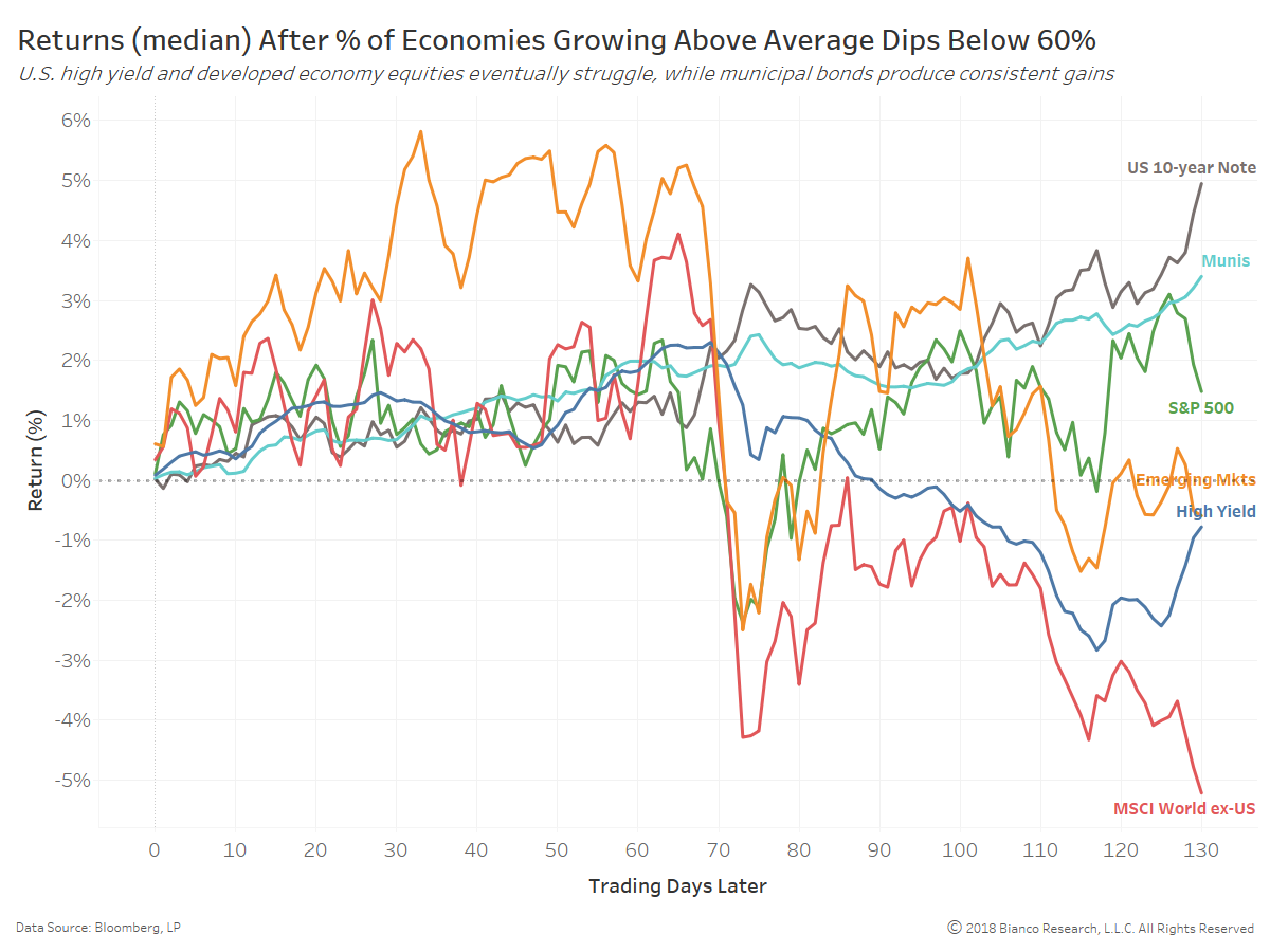
Breaks below 50% of economies generating economic surprises and above-average realized growth have historically resulted in higher volatility and drawdowns across risk assets.
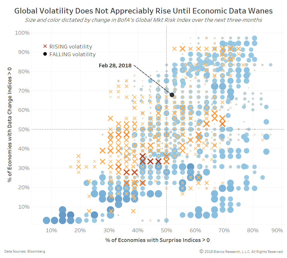
The chart below shows a scatterplot of the percentage of surprise indices versus data change indices above zero. The size and color of each instance indicate whether or not global implied volatility rose (orange Xs) or fell (blue circles) over the ensuing three months.
The transitions from beats to misses and ultimately below-average data changes results in the largest bursts of volatility across the globe. You will see the heavier dose of red Xs beginning just as both percentages fall below 50%.
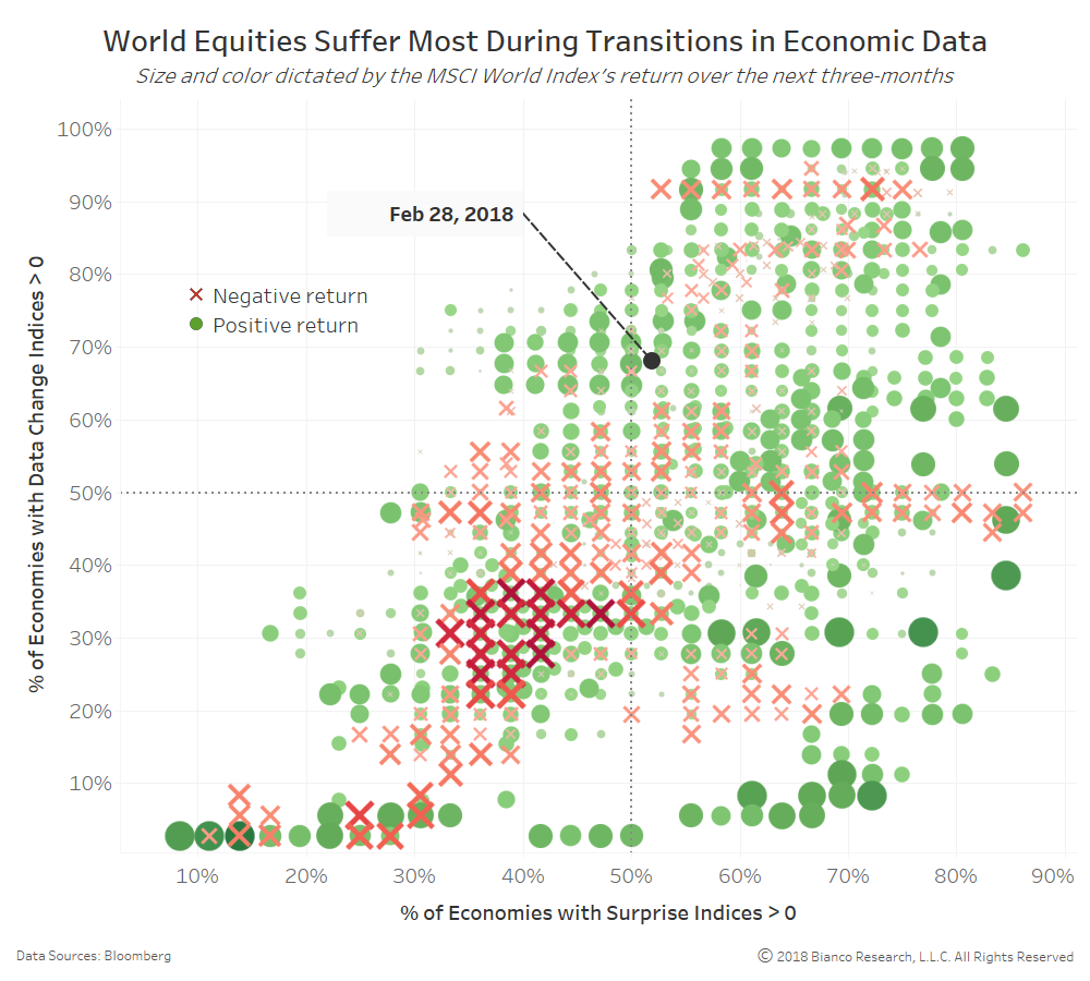
The next scatterplot shows the same relationship between economic surprises and data changes, but the size and color of shading represent positive (green dots) or negative (red Xs) returns produced by the MSCI World Index over the ensuing three months.
World equities are very susceptible to drawdowns during transitions below 50% by both metrics.