- Bloomberg – Wage Growth Is Coming. Those Profits Can’t Last
Employers report that replacing a departed worker is expensive — a red flag that the workforce is widely underpaid.
One of the big economic questions for 2018 is whether the strong economic expansion and the resolution of tax uncertainty kick the labor market and wage growth into a higher gear. It might take months for decisions made by corporations and workers to show up in the economic data. We’ll get some clues on what companies are thinking with earnings season underway and set to pick up this week. Already, though, the Beige Book, published by the Fed on Wednesday, revealed some clues on labor market dynamics and employer psychology that point to a pickup in wage growth and inflation in the months to come. - U.S. and Eurozone hard economic data (e.g. GDP and industrial production)
- U.S. and Eurozone soft economic data (e.g. consumer confidence)
- Inflation surprises
- Swaption volatility (1Y x 1Y)
- # of rate hikes expected over next 12 months by the ECB and FOMC
Summary
Comment
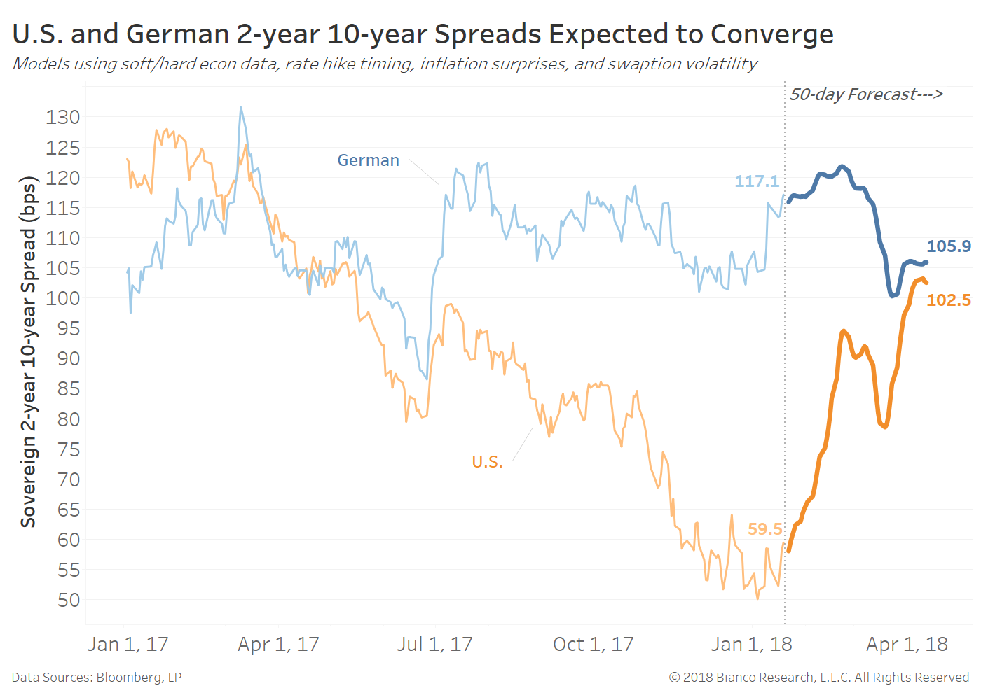
Forecasts are shown below as darker lines with the German curve flattening from current of 117.1 to 105,9 bps and the U.S. curve steepening from 59.5 to 102.5 bps. We expect German flatteners will become back in vogue near the steepest spreads seen since July 2017 at 122.4 bps.
We ended last week indicating a strong potential for the U.S. TIPS breakeven curve to steepen. Any hints of wages pressures like suggested in the article above would only increase the pace of rising inflation expectations further out the curve.
All in all, the German and U.S. yield curves appear ready to converge.
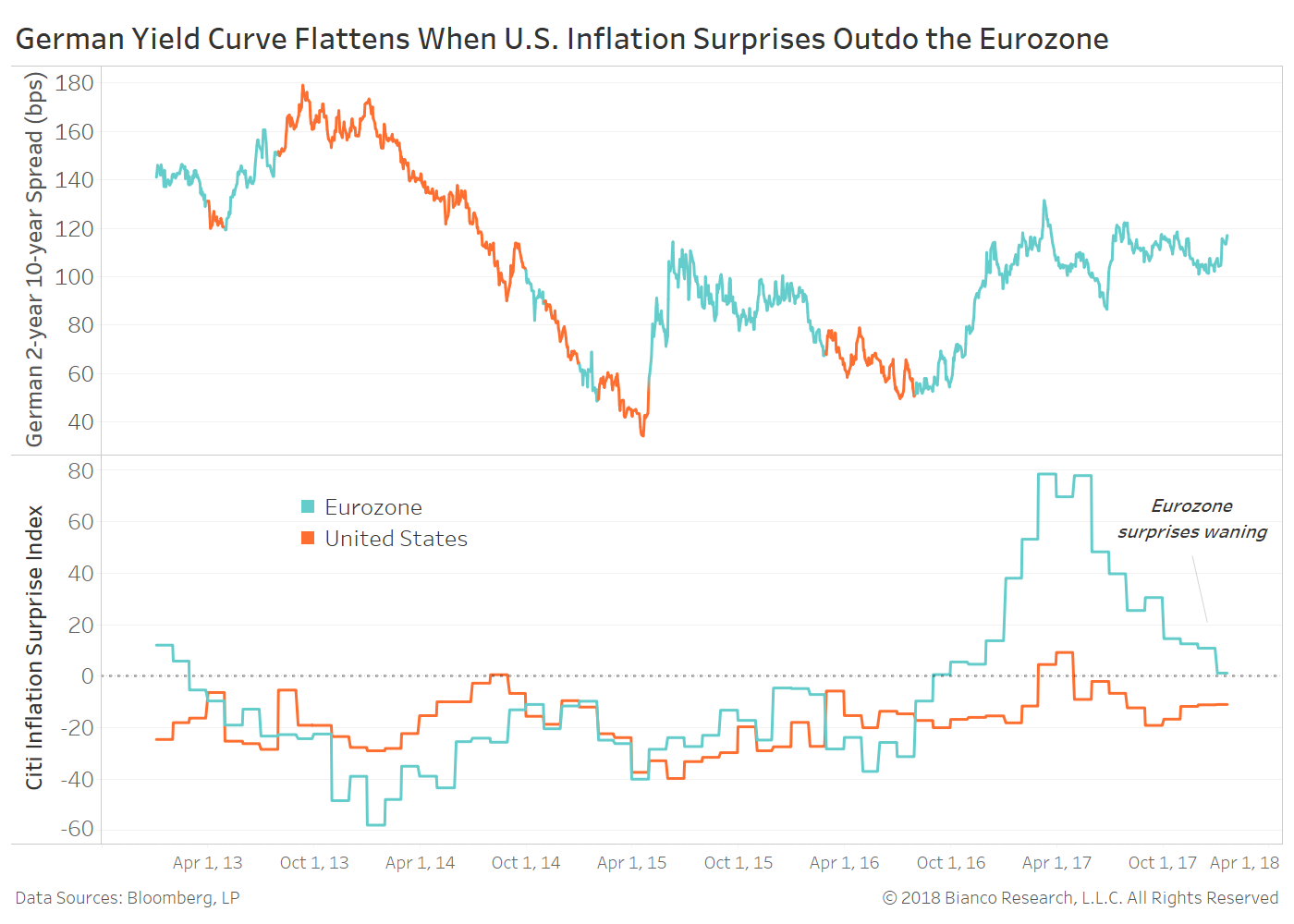
The bottom panel in the next chart shows the Eurozone (blue) and U.S. (orange) Citigroup Inflation Surprise Indices. The top panel provides a highlighted German 2-year 10-year spread based on when Eurozone inflation surprises are outpacing the U.S. or not.
Eurozone inflation beats have been waning in recent months. A break below zero by its index and potentially matching or falling below the U.S. have consistently been met with a flattening German yield curve (orange highlights).
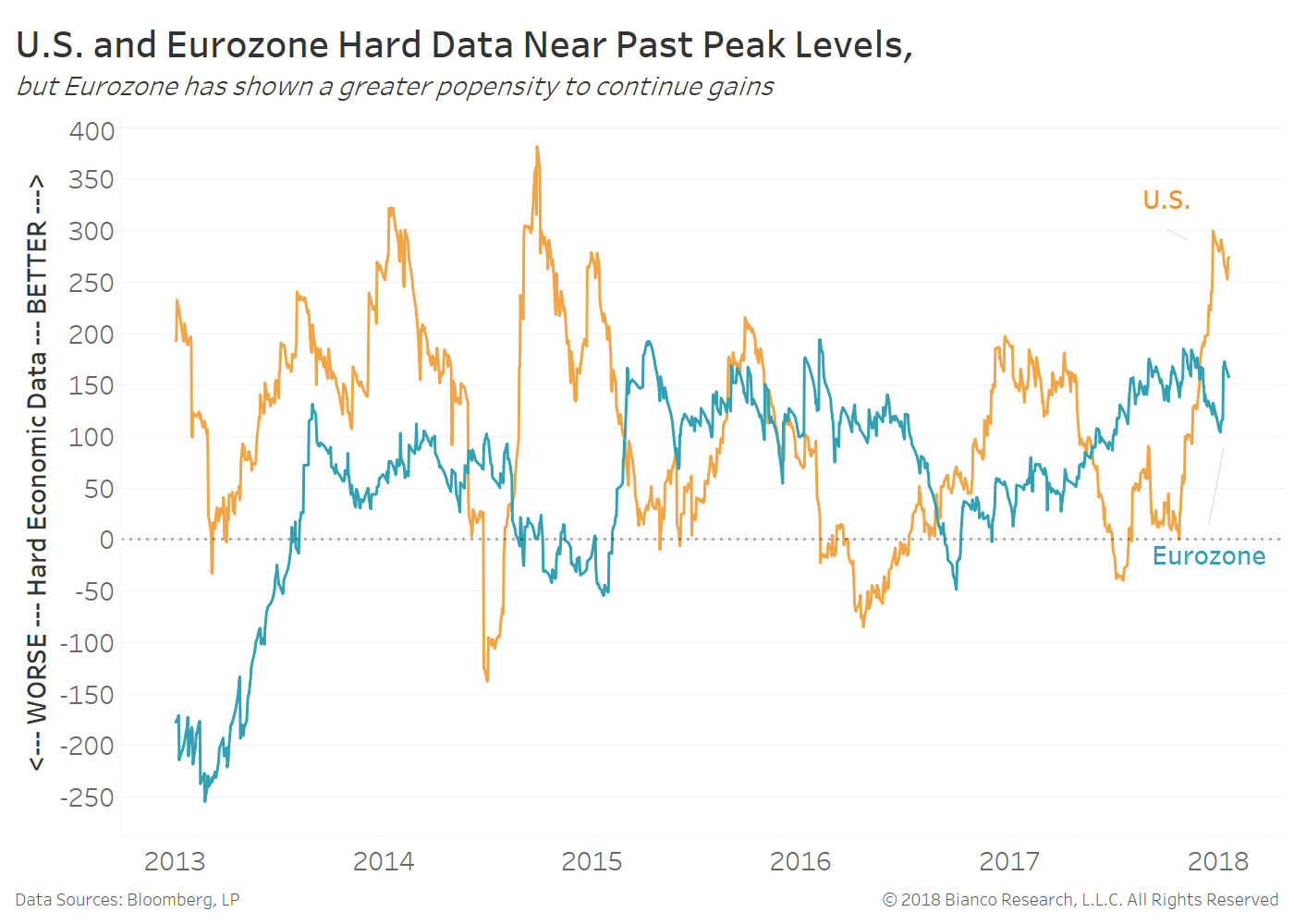
Hard economic data like GDP and industrial production enjoyed a swift rebound into the end of 2017 for both the U.S. (orange) and Eurozone (blue). However both are butting up against past peaks, suggesting tempering hard data in the months ahead.
But, be aware the Eurozone’s hard data have shown a stronger propensity to persist at above average growth rates. Continued Eurozone improvement will only produce further hawkish commentary. Draghi et al are expected to announce an eventual end to bond purchases in June. Tailwinds from strong hard data would only make this decision easier for both the central bank and markets.
Conversely, a pullback in U.S. hard data would rattle financial markets still hesitant to chase the lofty tightening expectations of the Federal Reserve. Any dent in tightening expectations has the potential to lead to bull flattening by U.S. Treasuries.
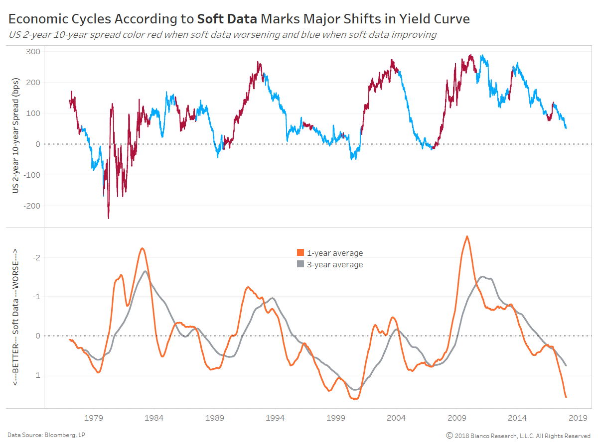
The U.S. Treasury yield curve very much abides by cycles in economic data, specifically soft data. We provide one- and three-year moving averages of soft data since 1977 in the bottom panel of the chart below. Be aware the axis has been reversed with lower index values indicating improving data.
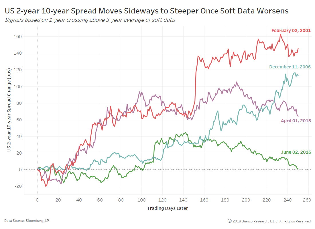
The top panel shows the US 2-year 10-year spread with blue shading marking periods when soft data is improving as determined by moving average crosses. These periods of better data are dominated by swift flattening. Conversely, periods of worsening data (red shading) see intense steepening. The fact we have to slow down the soft data index with moving averages suggests it leads shifts in the yield curve.
A set-back in optimism has been a bellwether of a less hawkish Federal Reserve and a steeper U.S. Treasury yield curve.
The relative steepness between German and U.S. 2-year 10-year spreads is the widest (58 bps) since mid-2006. A swift streak of inflation surprise beats across the Eurozone have promoted a steeper German yield curve since October 2016. But, tempering expectations and the likelihood soft U.S. economic data have peaked suggests convergence between German (flatter) and U.S. (steeper) yield curves.