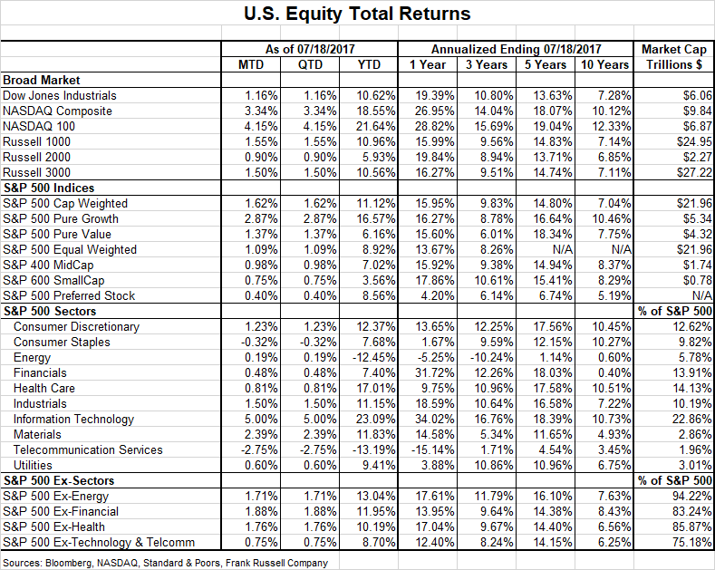
A decent year in stocks. As the table below shows, the stock market is having a decent year.
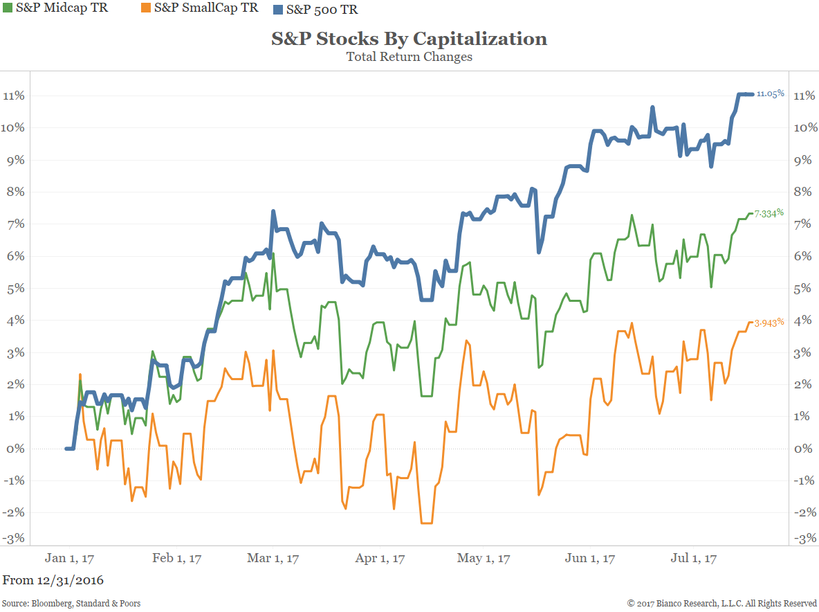
Large cap stocks leading the way. As the next chart shows, large cap stocks (blue) are leading the way as small cap stocks (red) lag badly.
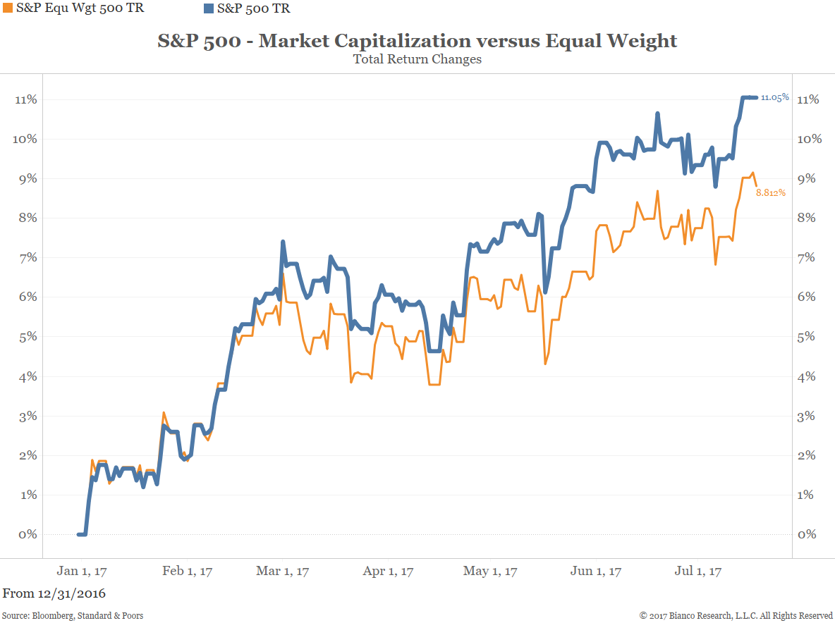
Market Cap weighted beats equal weight. Another way to show that large capitalized stocks are powering the overall market higher is the next chart. It shows the S&P 500 stocks market cap weighted (blue) and equal-weighted (orange). It is unusual for market cap to outperform equal weight by this degree.
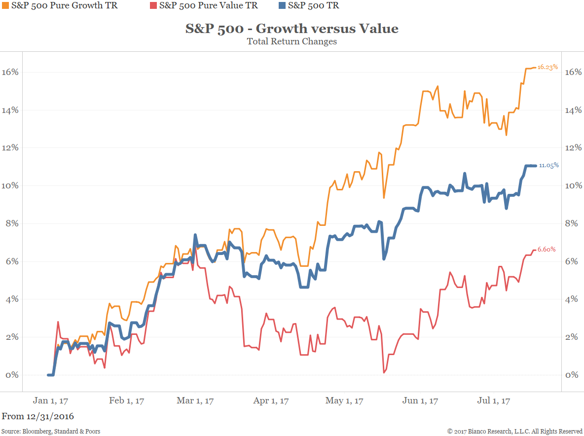
Growth beats value. The chart below shows the S&P 500 pure growth (orange) and pure value (blue). “Pure” means the S&P 500 universe is out into one of these two groups. Growth is dominated by large capitalization technology stocks (i.e., FAANMG) which explain why pure growth is handily outperforming.
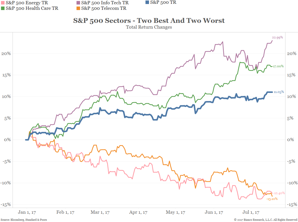
The best and worst sectors. The S&P 500 has 11 sectors. The two best (info tech and healthcare) and the two worst (energy and telecom) are shown below.
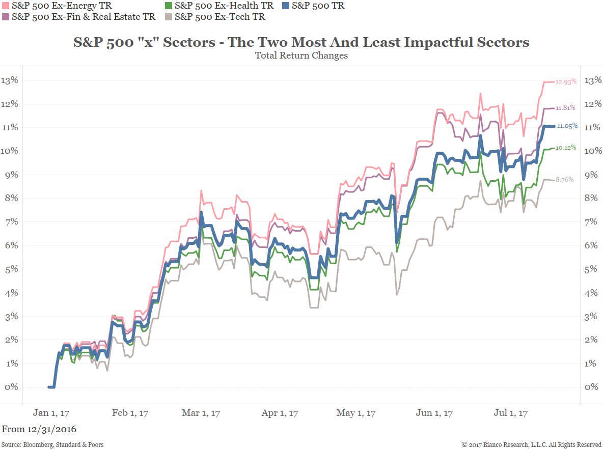
The most positive and negative influences on the S&P 500. The S&P also has 11 “x” sector indices. These are indices that exclude a specific sector. We show the two best and worst x-sectors below.
This is useful as it shows how much a sector influences the overall S&P 500 (by subtracting the “x sector from the overall S&P 500 in blue). So x-energy is up 12.93% versus 11.05% for the overall S&P 500. This means that the energy sector dragged down the overall S&P 500 1.88%. Conversely, x-info tech is up 8.76% against 11.05% for the overall S&P 500. This means the info tech sector has pushed up the overall S&P 500 2.29%.
Interactive Chart
The interactive chart below can be used to view the total returns for any or all of the 34 indexes provided under the “select an index” dropdown menu. The date range can be adjusted at the bottom of the chart.