- The Wall Street Journal – Economists React to the March Jobs Report: ‘Mostly Just Weather-Related Noise’
What economists and analysts said about Friday’s jobs report from the Labor Department
The disappointing 98,000 increase in nonfarm payrolls in March will be seized upon by the usual suspects as confirmation that the U.S. economy is poised for collapse, but the truth is this is mostly just weather-related noise. After the unseasonably warm January and February, which pushed monthly job gains back above 200,000, there was always going to be some payback in March, when the weather snapped back to seasonal norms, including some heavy snowstorms.
Comment
National Weather
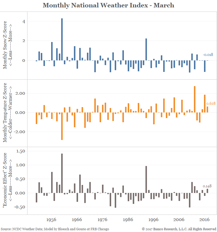
From the state data above, they also constructed a national index. Every March back to 1950 is shown in the chart below. The blue bars in the top panel show snow z-scores and the orange bars in the middle panel show temperature z-scores. The brown bars in the bottom panel show the “economic effect” z-score. We constructed this measure which is the average of the snow index and half the temperature index since snow matter more than temperature.
Even though the majority of the land mass of the country enjoyed warmer-than-normal temperatures and less-than-normal snow, the heavily populated northeast saw “economically” worse-than-normal weather. Sum it up and the national z-score for snow was -0.018, or essentially a normal month while the temperature z-score was .628, a warmer-than-average month. Taken together, with temperature getting a one-half weighting, the “economic effect” z-score was a slight negative of 0.148.
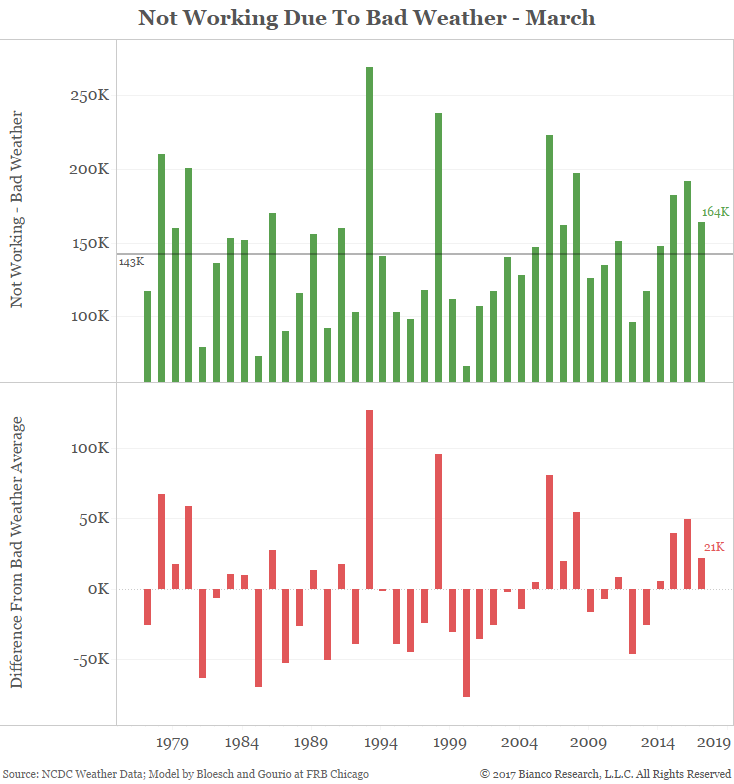
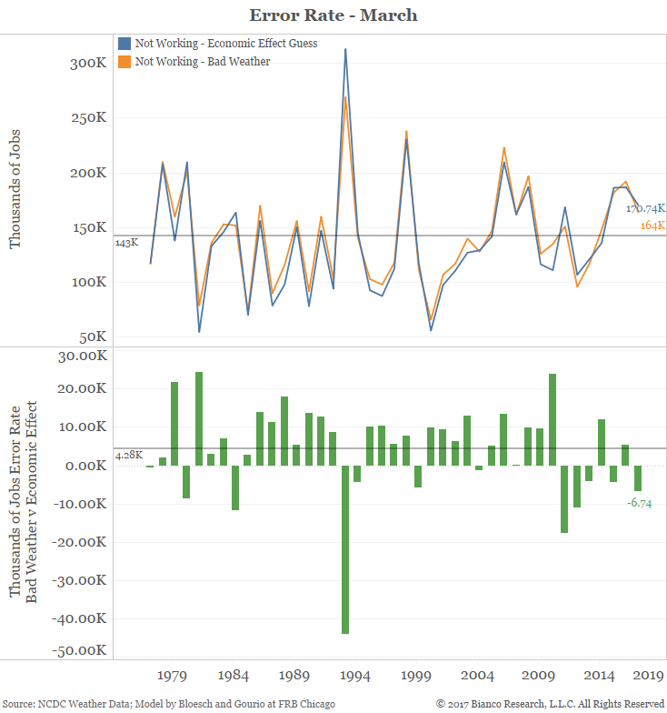
The next chart shows the difference between measure those not working due to bad weather in orange and our projection based on the “economic effect” mentioned above in blue.
Our measure predicted 170,740 people would miss work because of bad weather. The actual number was 164,000, for a miss of 6,740 jobs. The average error rate for all March readings back to 1976 is 4,280 jobs.
Conclusion
The population-weighted weather measures developed by Chicago Federal Reserve economists Justin Bloesch and François Gourio suggest weather was not a big factor in March. Perhaps the payroll miss was more due to actual weak data than many want to believe.
Below is an interactive dashboard of the data in the static charts above.
As the story above points out, economists are dismissing Friday’s payroll report as “weather-related noise.” However, some interesting new research suggests this might not have been the case.
Chicago Federal Reserve economists Justin Bloesch and François Gourio constructed some interesting weather indices that can help determine how much weather factored into the final payroll number. They took weather readings from the thousands of National Climate Data Center reporting stations, weighed each weather station by its local population and constructed a z-score for temperature and snow. These two measures most affect economic activity. A z-score of +1 standard deviations indicates a reading that is higher than 68% of all observations for the given month. A reading of -2 standard deviations indicates a reading that is lower than 95% of all observations.
State Weather
From their data, we constructed the interactive chart below. You can mouse over for each state to see its measure and change the month to any month back to January 1950.
In the case of temperature for March, the top chart shows the upper midwest and northeast were colder than normal while the western half of the country was warmer than normal. The bottom map shows snow was much heavier than normal in the northeast and largely below normal in the rest of the country.