- Bloomberg Business – Tracy Alloway: A Perfect Storm Brews for Bond Funds
Soon it could be tough to save for a rainy day
Post-financial-crisis regulation has sharply reduced investors’ freedom to buy and sell securities without affecting prices, according to many (many) market participants. Overheating in the bond market has exacerbated the problem, according to many others. That’s caused some to worry about the ability of fixed-income funds to withstand a big sell-off in bonds. Many fund managers have been increasing their credit lines to protect themselves against the possibility of a wave of redemptions by nervous investors. Bloomberg reported last week that Aberdeen Asset Management has arranged $500 million in credit lines to cushion the blow of a potential bond sell-off. BlackRock, Vanguard, Goldman Sachs Asset Management, Guggenheim Partners, and Eaton Vance are also said to have made extra borrowing arrangements with banks in recent months. Those arrangements may prove prudent, according to Barclays analysts led by Brad Rogoff. In research published on Friday, the Barclays analysts look specifically at funds that comprise or track leveraged loans, or loans made to companies with weaker balance sheets. Liquidity is a particularly acute problem for such funds, since leveraged loans are traded in a unique and kind of old-fashioned way. But their problems could be extrapolated to a broader array of investment vehicles.
Comment
<Click on chart for larger image>
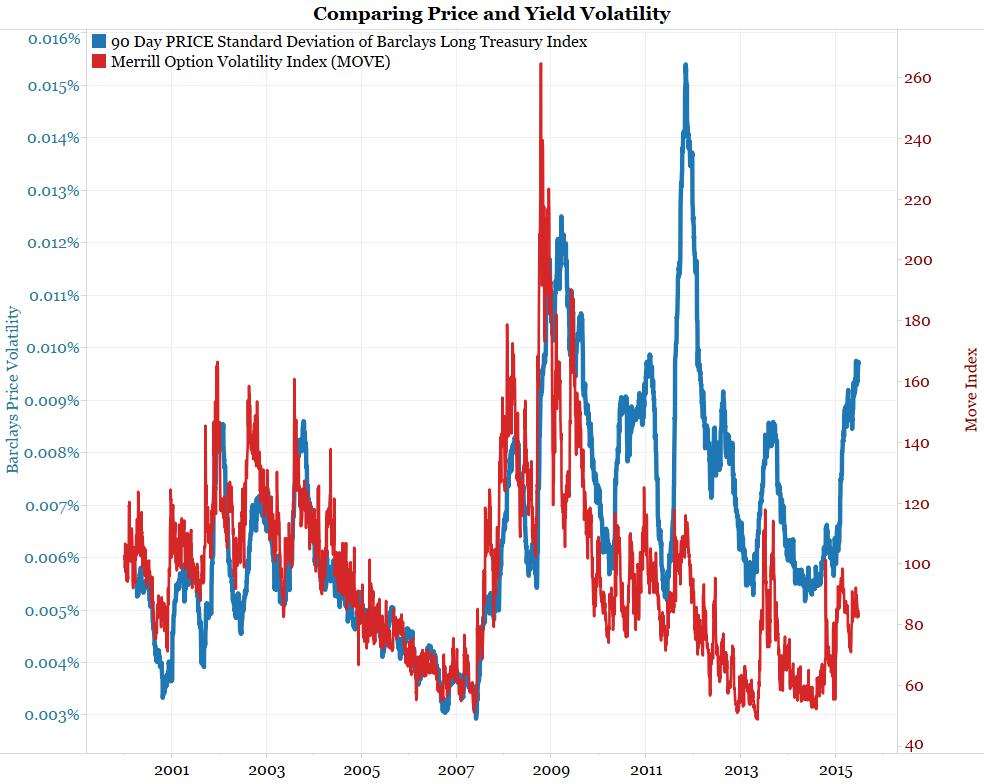
The next chart takes the same price volatility index (blue) and overlays it with the popular MOVE index (red). The MOVE index measures yield volatility.
Note that the price volatility measure (blue) and the yield volatility measures (red) closely followed each other from 2000 to 2010. Since 2010 price volatility and yield volatility have diverged with price volatility remaining consistently higher.
<Click on chart for larger image>
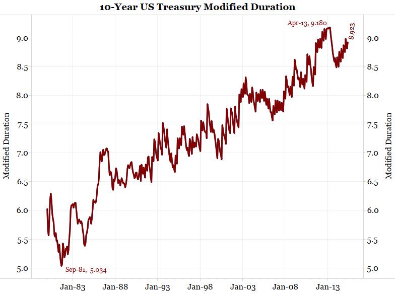
Why are price volatility measures consistently higher? Durations are longer thanks to positive convexity. The next three charts show measures of Treasury modified duration (how much prices move given an instantaneous 1% move in yields). Note how much longer durations are now relative to the pre-crisis period. When central banks engage in QE and force rates down, they push durations very long and make price movements larger for the same yield movement.
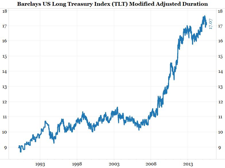
<Click on chart for larger image>
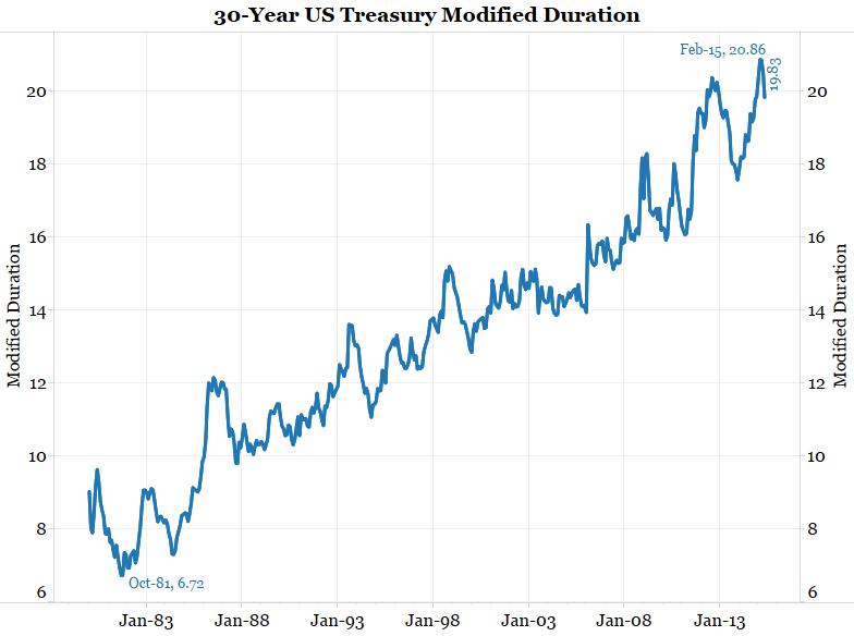
<Click on chart for larger image>
<Click on chart for larger image>
The next two charts show duration measures in Europe. With ECB QE pushing yields to record lows, European durations have also extended to record levels.
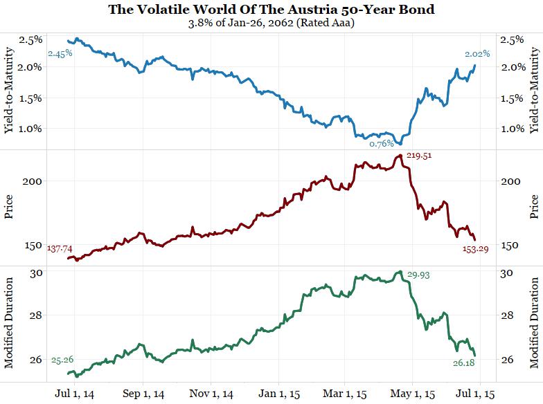
<Click on chart for larger image>
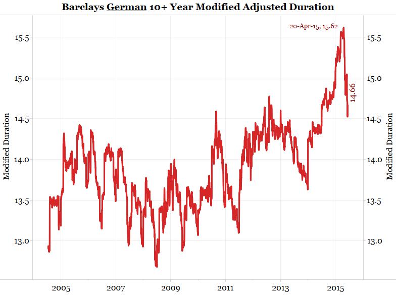
<Click on chart for larger image>
Wall Street continues to argue liquidity problems are a function of regulation on dealers. While regulatory changes are not helping, we believe the structure of the bond market has changed.
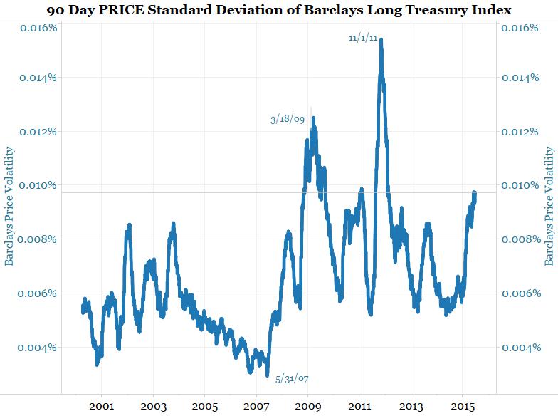
The chart below shows bond market price volatility. The gray vertical line highlights Friday’s level (June 26) was pretty high. Only the periods of March 2009 (the height of the crisis) and November 11 (the 90 days following the U.S. downgrade) saw higher volatility.