Summary
Comment
U.S. equity (VIX) and Treasury (MOVE) implied volatility are again showing heightened positive correlation like the summer of 2017. Previous similar events coincided with significant geopolitical or financial events like 9/11, the flash crash, or S&P downgrade.
Therefore, the current event of connected risks is difficult to label just like a year ago.
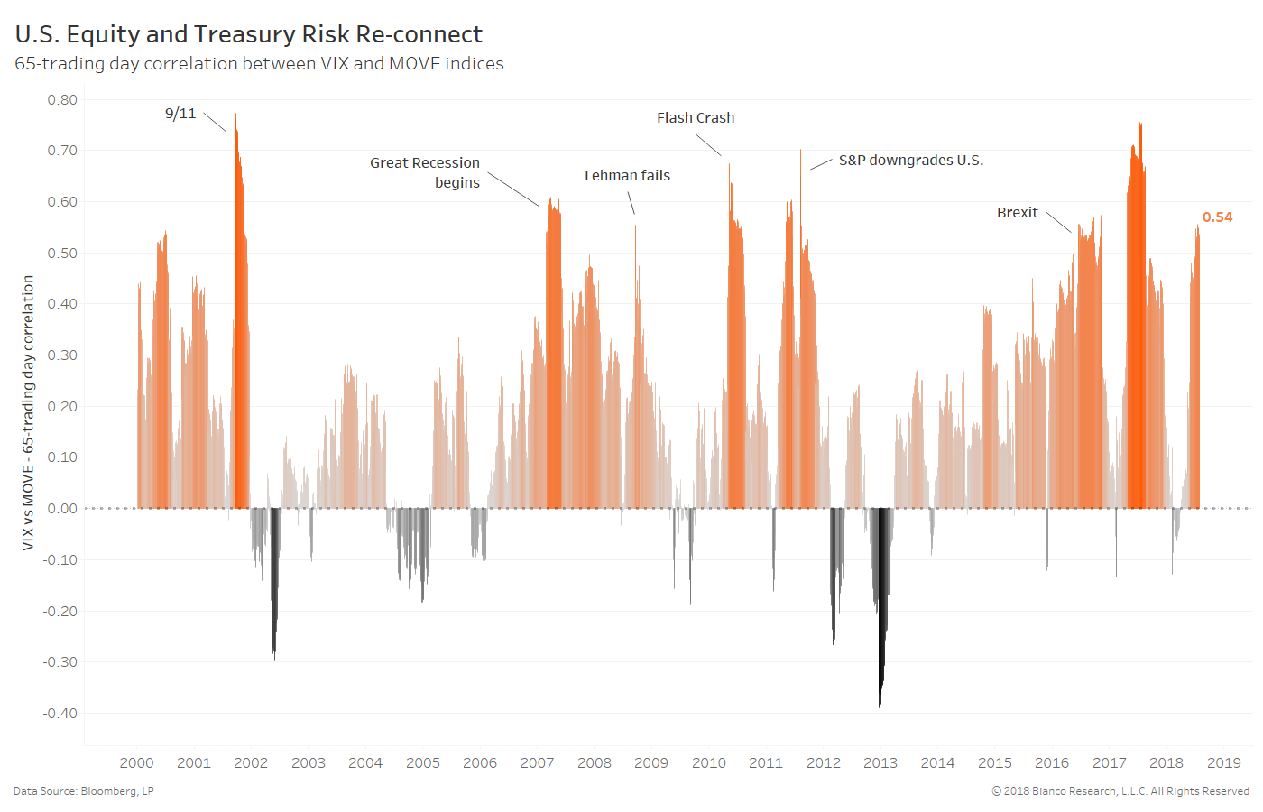
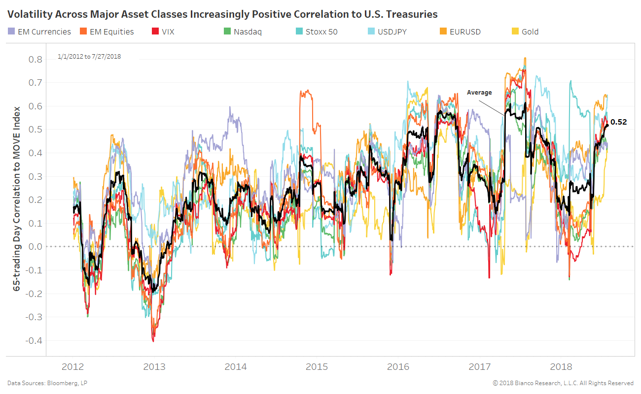
The next chart shows the 65-trading day correlation between implied volatility for each asset class and U.S. Treasuries. Highly correlated volatility implies unexpected events could damage nearly all markets, meaning there would be little place to hide.
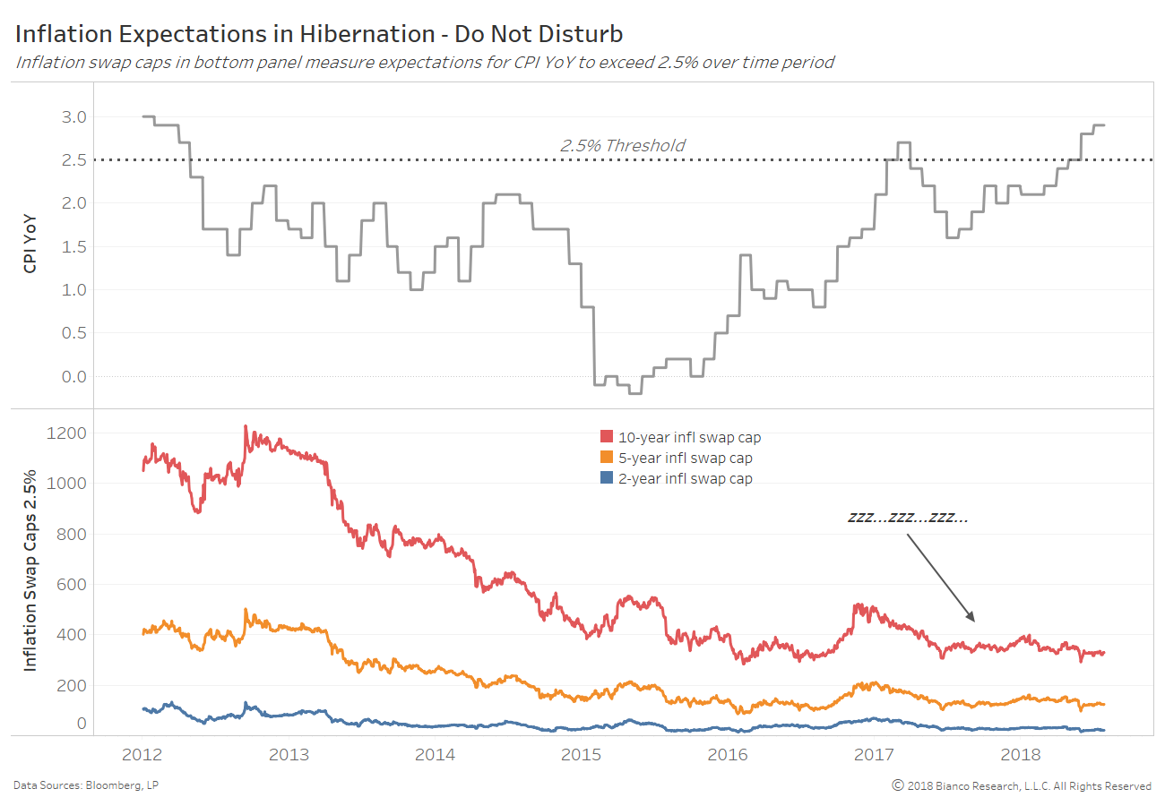
Are risk assets calmly awaiting the direction inflation expectations will finally take after an extremely dull, range-bound period?
But, the Federal Reserve’s steadfast belief in inflation and wage growth have yet to truly excite investors in inflation expectations like swap caps. Swap caps are effectively call options headline inflation will run above the strike for the defined time period.
The chart below shows headline CPI year-over-year exceeding the critical 2.5% threshold while caps with a 2.5% strike remain essentially dormant. Inflation expectations have not endured a period of excitement since late 2016.
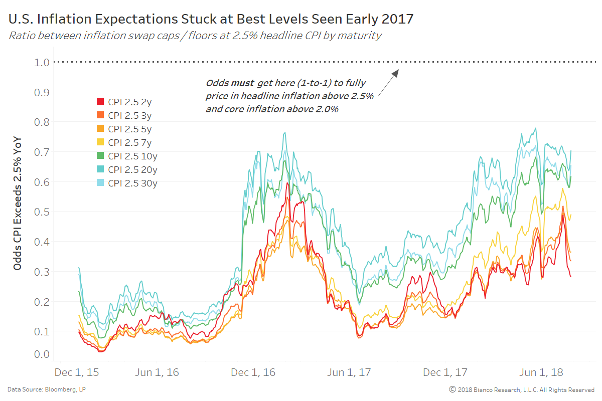
The next chart is a favorite of ours showing the ratio between inflation swap caps and floors at a strike of 2.5% year-over-year. These ratios offer the odds headline inflation runs above 2.5% on average for the defined maturity from 2 through 30 years.
Breakouts above the best levels of early 2017 are needed and eventually above 1-to-1 odds to show investors have fully committed to the rosy inflation outlook.
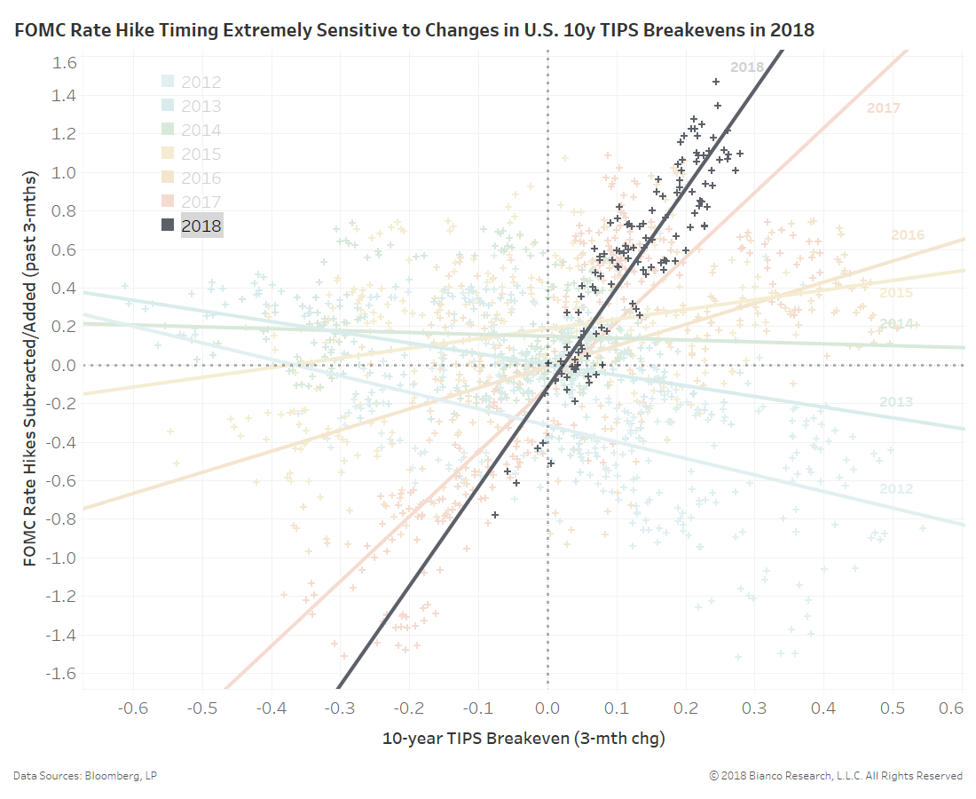
Most importantly, inflation expectations like U.S. 10-year TIPS breakevens are seemingly the de facto chair of the Federal Reserve. The relationship between three-month changes in U.S. 10-year TIPS breakevens (x-axis) and FOMC rate hike timing (y-axis) is shown below by year.
In 2018, a 25 bps rise in TIPS breakevens have resulted in a 25 bps rise in expected rate hike timing, the steepest slope post-crisis. TIPS breakevens have been struggling to choose a direction, which reinforces low volatility throughout markets. Additionally, this has fostered a ‘wait and see’ approach by investors in nearly all risk assets. The eventual breakout, in either direction, by inflation expectations will transfer into nearly all asset allocation decisions.