- The New York Times – Binyamin Appelbaum: Some Fed Members Back Quicker Move on Rates
The Fed also announced a few housekeeping changes, primarily of interest to close watchers of the central bank. Fed officials are now prohibited from speaking about monetary policy for 10 days before a policy-making meeting, rather than one week. The Fed also said it would expand the information provided with its quarterly economic forecasts to include an illustration of the uncertainty surrounding the projections.
Comment
Inside Baseball: The Fed is adding three days to its pre-meeting blackout period, and introducing fan charts on its forecasts in March.
— Binyamin Appelbaum (@BCAppelbaum) February 22, 2017
This begs two questions:
- Why does the Fed want to start its blackout period on the second Saturday before the FOMC meeting? That makes the blackout period roughly 10 days long instead of the current policy of 7 days. Why is the extra three days significant?
- What is a fan chart?
In Yellen’s Jackson Hole speech last August, she presented a version of a fan chart using the June 2016 projections:
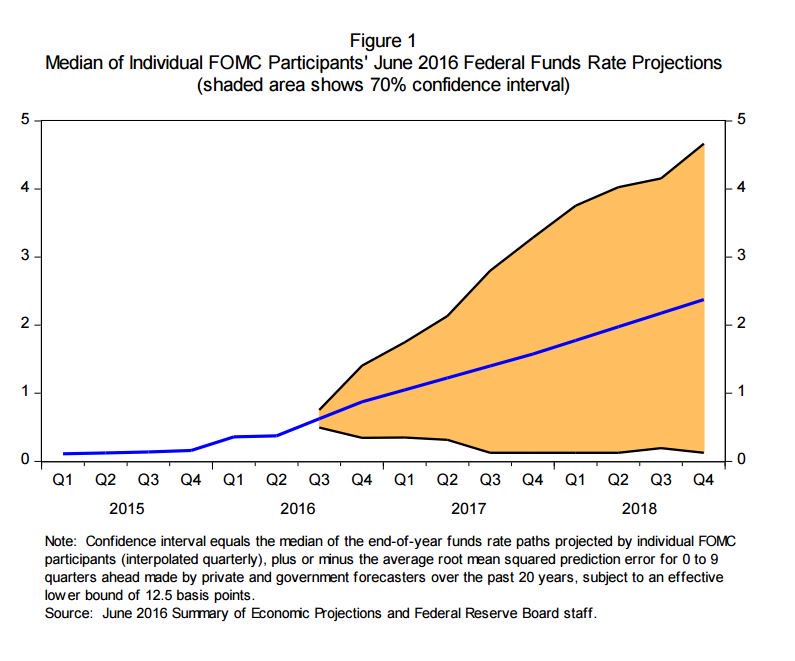 <Click on graphic for larger image>
The chart below shows how the Fed currently presents the same data. Is the fan chart above really an improvement over the dots below?
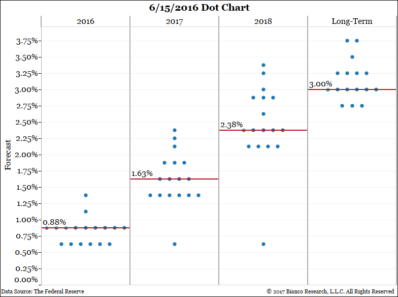
<Click on graphic for larger image>
If this is an accurate representation of how the Fed is going to change its Summary of Economic Projections (SEP) next month, it is another example how the Fed tries to be transparent and just winds up confusing everyone even more.
The highlighted comment above was in reference to a passage on page 8 of the minutes released yesterday:
The Committee considered amendments to its Policy on External Communications of Committee Participants and its Policy on External Communications of Federal Reserve System Staff. The amendments consisted of (1) starting the communication blackout earlier (the second Saturday before Committee meetings); (2) revising the treatment of staff presentations during the blackout period; (3) revising provisions regarding regularly published System releases of data, survey results, statistical indexes, and model results during the blackout period; (4) explicitly recognizing the need for ongoing communications with the public by staff members during the blackout period for operational or information gathering purposes; and (5) making several miscellaneous changes, generally to improve clarity. All participants supported the revisions, and the Committee voted unanimously to approve the revised policies.
What does all this mean? As Binyamin Appelbaum explained in a tweet: