 <Click on graphic for larger image>
- Bloomberg.com – This New Indicator Shows the U.S. Job Market Finally Heating Up
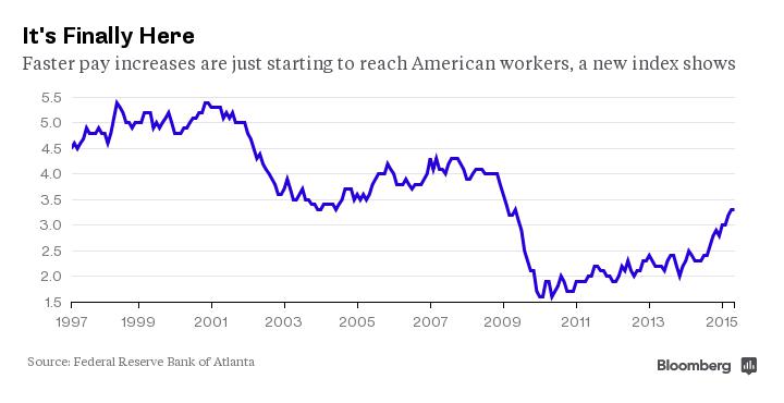
Just how quickly is everyone’s paycheck growing? It’s one of the most important questions in the American job market right now, with only inconclusive answers derived from conflicting data so far. This week, a regional Federal Reserve bank added a new indicator to the mix in hopes of offering policy makers a closer look at what’s really happening in the U.S. job market. The new index—which shows a median wage increase of 3.3 percent in the 12 months through May, a substantially faster pace than even just a year ago—gives ammunition to central bank hawks who would like to raise interest rates in September. There are currently two principal measures of wages: the Labor Department’s average hourly earnings measure, which will be reported on Thursday, and the Employment Cost Index, a broader measure that includes benefits. They give somewhat conflicting pictures on the state of wages, with hourly earnings up 2.3 percent though May and quarterly ECI up a more robust 2.8 percent through the first quarter, excluding government workers. The Atlanta Fed’s newly introduced measure is based on Census Bureau questions to thousands of households, compared to other measures that survey businesses. “We are seeing signs of wage pressure,” says John Robertson, a senior policy adviser at the regional bank. While some economists consider the Employment Cost Index the single best measure of earnings, an advantage of the Atlanta Fed’s tracker is it will come out monthly and provide a much faster take on the job market.
Comment
<Click on chart for larger image>
As we said last month:
We believe that economic analysis often tells you little about the economy and a lot about the bias of those torturing the data (we, of course, are immune to such biases at Bianco Research!).
The Fed wants to raise rates, so any indicator that supports such a view immediately moves to the top of the list. The indicator mentioned above, with a demonstrated 6-year track record of success, shows the economy is still underperforming. Since it does not support the narrative the Fed wants right now, it gets ignored.
Finally, as is often the case, as the Atalanta Fed says wage growth is going up, the St. Louis Fed finds something different.
<Click on graphic for larger image>
- Federal Reserve Bank Of St. Louis – Lagging Long-Term Wage Growth
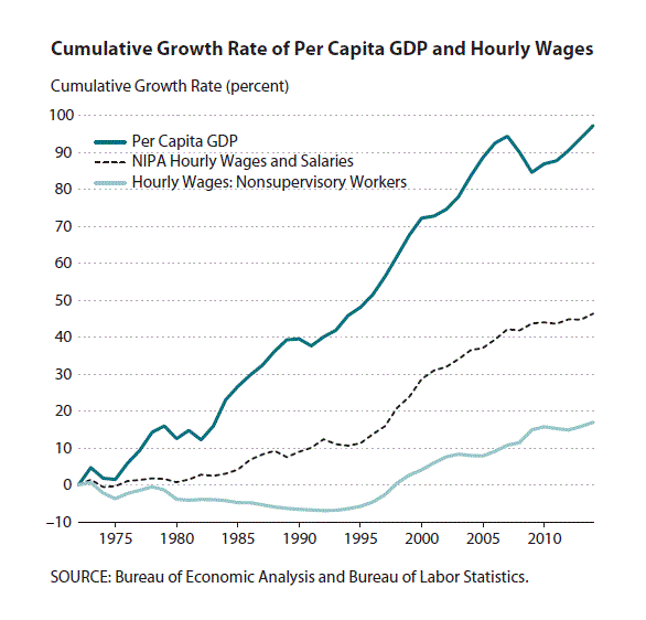
The long-run trend of average wages has consistently failed to keep pace with overall economic growth.
The U.S. economy has experienced a slow job recovery since the 2007-09 financial crisis. As the unemployment rate finally fell below 6 percent in the last quarter of 2014, concerns about the state of the economy gradually shifted to wage growth. Instead of focusing on wage growth during the years since the financial crisis, in this essay we examine long-term wage growth since 1972. Specifically, we see if wages have kept pace with overall growth in the economy by comparing hourly wage growth with per capita gross domestic product (GDP) growth. We compare GDP data from the National Income and Product Accounts (NIPA) and two hourly wage data series. The first data series is from the Bureau of Labor Statistics establishment survey, which reports the average hourly wage for all nonsupervisory workers.1 To check for robustness, we also compute a second hourly wage series by dividing the total wages and salaries reported in NIPA by the total hours worked from the establishment survey data. Finally, we deflate all nominal price data, including nominal GDP data, to real GDP data using the personal consumption expenditures (PCE) price index.
Here we go again. The highlighted passage above is spot on.
18 months ago the Fed did not want to raise rates and the diving unemployment rate was “getting in the way.” No worries, the Fed invented the Labor Markets Condition Index (LMCI) to show the labor market as weak. Now that many at the Fed want to raise rates, they invent a metric that shows wage pressure.
The Fed has a history of dragging out new indicators that support their preconceived views of the economy. They have hundreds of PhDs and statisticians on their payroll constantly constructing new indices like the one mentioned in the story above. It then becomes very easy for Fed officials to start with a conclusion on the economy or desired monetary policy and find one of these relatively obscure measures that supports their view.
We are not suggesting this indicator is less than an honest effort. It uses public data and is very clear on how it is calculated. But like all invented Fed indicators, it has a point of view.
Case in point, why doesn’t the Philadelphia Fed’s Aruoba Diebold Scotti Business Conditions Index, mentioned in the story below, get more attention? It is a high frequency measure with a good track record.
The Aruoba-Diebold-Scotti business conditions index is designed to track real business conditions at high frequency. Its underlying (seasonally adjusted) economic indicators (weekly initial jobless claims; monthly payroll employment, industrial production, personal income less transfer payments, manufacturing and trade sales; and quarterly real GDP) blend high- and low-frequency information and stock and flow data. … The average value of the ADS index is zero. Progressively bigger positive values indicate progressively better-than-average conditions, whereas progressively more negative values indicate progressively worse-than-average conditions. The ADS index may be used to compare business conditions at different times. A value of -3.0, for example, would indicate business conditions significantly worse than at any time in either the 1990-91 or the 2001 recession, during which the ADS index never dropped below -2.0.