<Click on chart for larger image>
Comment
- The Wall Street Journal – Where Americans Spend Their Money
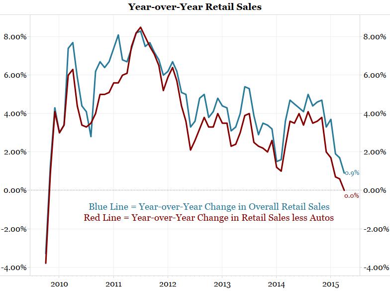
April’s retail sales report didn’t offer much in the way of bright spots. Overall sales barely budged and have now been down or flat for four of the past five months. Tepid spending by American consumers has been a puzzle for many economists. Employers are adding jobs, wages have shown tentative signs of picking up, gasoline prices are way down from a year ago and polls show growing confidence. “Forget ‘shop ‘till you drop’, let’s just hope consumers simply start shopping,” said Joel Naroff, chief economist at Naroff Economic Advisors.
<Click on graphic for larger image>
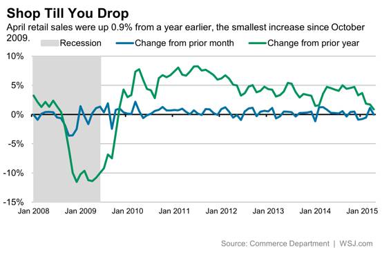
Americans have gotten a windfall from cheaper gasoline prices. But so far, they appear to be saving some of that money rather than spending it.
<Click on graphic for larger image>
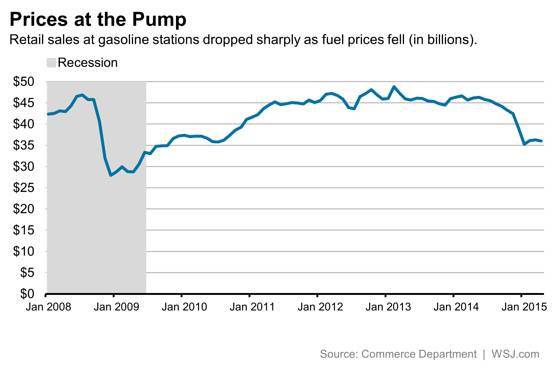
It hasn’t been all doom and gloom. Some discretionary spending has been particularly strong. Restaurant and bar sales jumped 0.7% last month, suggesting Americans are willing to shell out money on nonessentials. That may be coming at the expense of grocery store sales, though.
<Click on graphic for larger image>
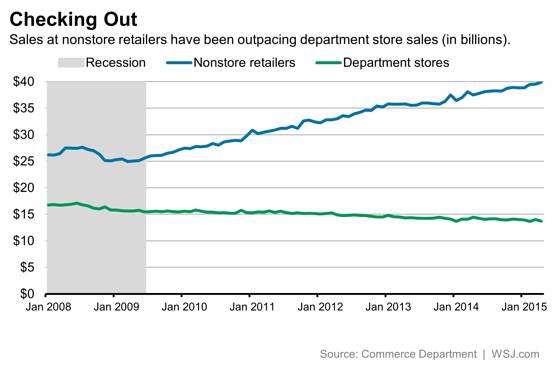
And in another sign that many households are merely shifting expenses–and habits–rather than boosting spending, nonstore retailers (largely online sales but also those via infomercials, catalogs, door-to-door sales and vending machines) saw a healthy gain last month while department stores continued their long decline.
<Click on graphic for larger image>
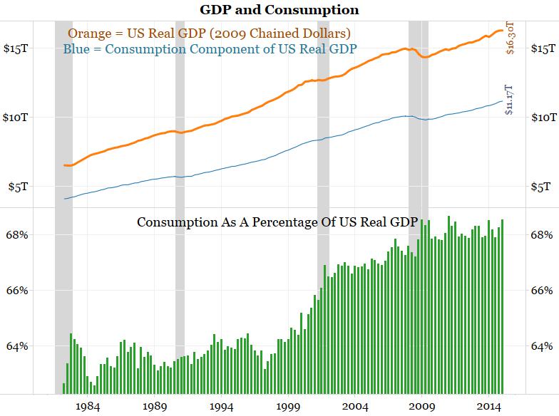
So how much money are Americans spending? The charts below show the broadest measure available, the consumption component of GDP. Retail sales is a subset of this measure.
The first chart below shows real GDP in orange, the consumption component of GDP in blue and consumption as a percentage of real GDP in green. In Q1 2015 consumption made up 68.53% of GDP, the second highest percentage ever (only Q1 2011 was higher).
As a side note, this chart illustrates why the Fed favors borrowers who want lower rates over savers who want higher rates. Nearly 70% of the economy is driven by consumption, so spenders must be accommodated when the economy needs a push.
<Click on chart for larger image>
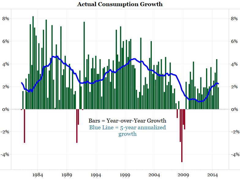
The bars in the next chart show actual year-over-year consumption growth while the blue line shows a 5-year annualized growth rate.
First quarter year-over-year growth was rather disappointing at 1.90%, which was below the 5-year annualized growth rate of 2.25% (which now excludes the Great Recession). From Q4 1983 to Q4 2008 the 5-year annualized growth rate was always above 2.25%.
<Click on chart for larger image>
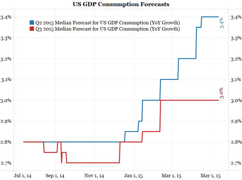
Despite slow growth throughout the past few years, economists are optimistic that consumption will dramatically pick up over the next two quarters. The next chart shows Bloomberg’s median consumption estimate from roughly 25 economists. The blue line shows Q2’s estimate while the red line shows Q3’s. Wall Street expects consumption to spike from the current reading of 1.90% in Q1 to 3.4% in Q2. Q3 forecasts are at 3.0%. Note these forecasts have trended higher since late last year. This optimism has largely been based on the idea lower gasoline prices will drive consumption growth higher.
Also note that these estimates have not been updated in the wake of yesterday’s disappointing retail sales. We suspect these forecasts will fall in the weeks ahead.
<Click on chart for larger image>
The Biggest Economic Story Of The Year
We believe the biggest economic story of the year thus far has been sluggish growth in retail sales and overall consumption despite plummeting gas prices. Economists were positively giddy about the prospects for the economy at the start of the year based on the collapse in oil prices. The lack of follow-through in spending, and the larger economy, can also be seen in the block above showing the big slide in the Citi and Bloomberg Surprise indices.
Five months into the year economic data is still sub-par. Retail sales growth is almost negative and consumption was lackluster in Q1. The list of excuses are dwindling. The Spring thaw started in early March but the March and April data has not shown a big bounce back. The West Coast port slowdown, which did not affect the economy to nearly the degree many believed, ended on February 23 and is no longer a consideration in growth prospects.
So why didn’t falling gas prices boost the economy?
It Was Not A Random Event
When oil prices collapsed, economists made a fundamental mistake. They never bothered to ask why the price of crude oil fell 60%. Instead they focused on the savings to the consumer from this windfall.
We have highlighted the following chart several times to show that the fall in crude oil coincided with a fall in world economic forecasts. As the outlook for the world economy fell, it was surmised that the demand for crude oil would fall and the price declined.
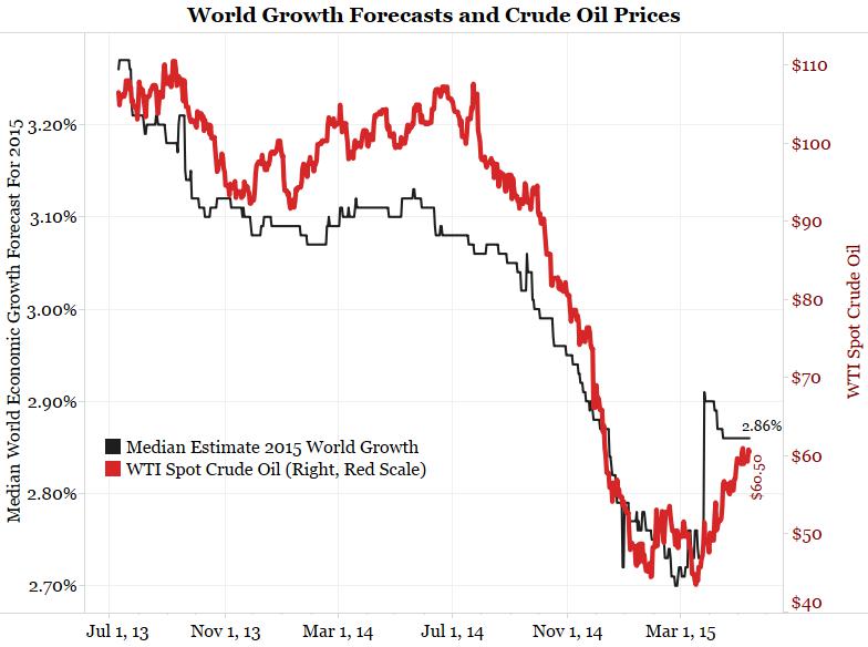
<Click on chart for larger image>
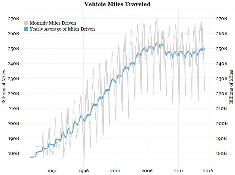
To further support the idea of lower demand for crude oil, consider the Department of Transportation’s data on the total vehicle miles driven in the United States. This data steadily rose from 1919 (page 54) to 2008. Through the Great Depression, World War 2 and the great inflation of the 1970s vehicle miles driven only stalled briefly during the worst of those periods.
The gray line in the chart below shows the monthly miles driven while the blue line shows its rolling 12-month average since 1987. The monthly average shows a tremendous amount of seasonality, but the blue line clearly shows total miles driven peaked in 2008. This is the first time since the invention of the Model T in the 1920s that this country has gone 7+ years without making a new high in total miles driven.
Why did this measure peak? Considering the daily commute to work makes up the largest part of miles driven, the spike in unemployment during the Great Recession was too large a hurdle to overcome. After that, we believe the U.S. finally hit a saturation point with cars. Everyone that wants/needs one has one. If this is the case, miles driven and car sales will now largely follow population growth.
<Click on chart for larger image>
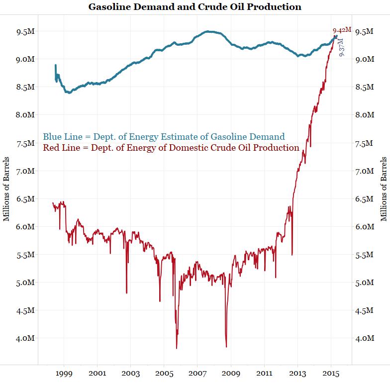
The effect of the peak in miles driven can be seen in the chart below. The blue line shows U.S. gasoline demand as calculated by the Department of Energy. The red line shows total U.S. crude oil production.
Although gasoline demand has peaked, the fracking boom has led to a dramatic increase in crude oil production.
<Click on chart for larger image>
About 50% to 60% of crude oil production is turned into gasoline. So the boom in crude oil production is creating a lot of new domestic sources of gasoline supply. But the peak in miles driven, along with new efficiencies in cars, means the demand for gasoline has stagnated.
The chart above shows supply and demand on a longer time-frame. What about the last year or two?
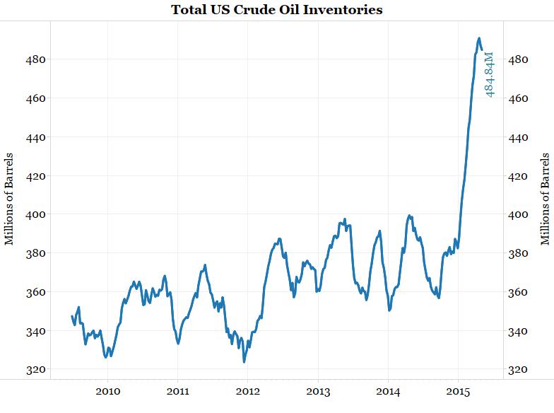
The next chart shows total U.S. crude oil inventories. Inventories are what is left over after production and demand. As the chart shows, inventories were fairly stable until late last year. Then they spiked in an unprecedented fashion to their highest level ever.
Why did this happen? First see the production chart above. Although production ramped up many years ago, inventories held relatively stable until the beginning of 2015. This, along with the charts above supporting the idea of decreased demand, points to a change in demand as the culprit behind increased inventories.
<Click on chart for larger image>
Conclusion
Economists seem to view the drop in crude oil prices as a random event, so they treated the fall in gasoline prices as a pure “tax cut”. The thought was lower gas prices would essentially put extra money in everyone’s pockets. Based on this, economists increased their forecasts for retail sales and/or consumption. These savings never resulted in spending or higher overall economic growth, so the surprise indices slumped to their lowest levels of the post-crisis recovery.
To further compound this issue, economists largely overlooked the fact that world economic growth was falling, gasoline demand was stagnating and U.S. crude oil inventories were spiking.
Crude oil fell because economic results turned south and demand slumped. This slump meant consumers were going to spend less on everything, including gasoline. As a result, consumers seem more content paying down debt or saving money rather than spending money.
When crude oil prices respond to changes in demand, they are an economic indicator. For years prices held around $100/barrel. The collapse to $60 should be taken as a sign that the economy is not nearly as robust as it once was.
Yesterday we noted that April’s retail sales numbers disappointed. This follows a string of disappointing results which, as the chart above shows, has led to the slowest year-over-year growth since the recovery began.
Below is a story detailing what money is being spent on and what it is not being spent on.